Fire TV Submission
Typical Review Time
Amazon review typically takes to take in the region of 3-10 working days
Text
App title
The name of your app
- 200 chars
Short description
A brief description of your app, shown on mobile devices
- 1200 chars
Long description
A lengthier description of your app, for the Appstore website
- 4000 chars
Product feature bullets
Up to 10 key features of your app, one feature per line. These features will appear on the Appstore website, formatted as a bulleted list
Keywords (optional)
Search terms used to increase the discoverability of your app, Use a comma or white space to separate your terms
Imagery
Summary of Required Imagery
| Usage | Size | Format | Transparency |
|---|---|---|---|
| App Icon | 1280x720 | PNG | No |
| App Icon - tablet | 114x114, 512x512 | PNG | Yes |
| Background Image | 1920x1080 | JPEG | No |
App Icon
Resolution 1280x720 | Format PNG | Transparency No
The App Icon appears within a row of other app icons in the Fire TV user interface.
Best Practices
- Original Assets: App icons should reflect the original developer-submitted assets.
- Contrast: Contrast will make the app icon distinct even when it is scaled down.
- Balance: Use imagery that has a sufficient amount of white space.
- Fewer Subjects: Fewer characters in app icons is preferred.
- Assets: There should be no marketing slogs or studio badging, only logos or key art.
- Legibility: Fo not overlap logos on major characters or on a busy background.
- Styling: Key art should go to the edge of the image, do not include borders or rounded corners.
Example

Example App Icon
Context
The App Icon appears on Fire TV in the following context.
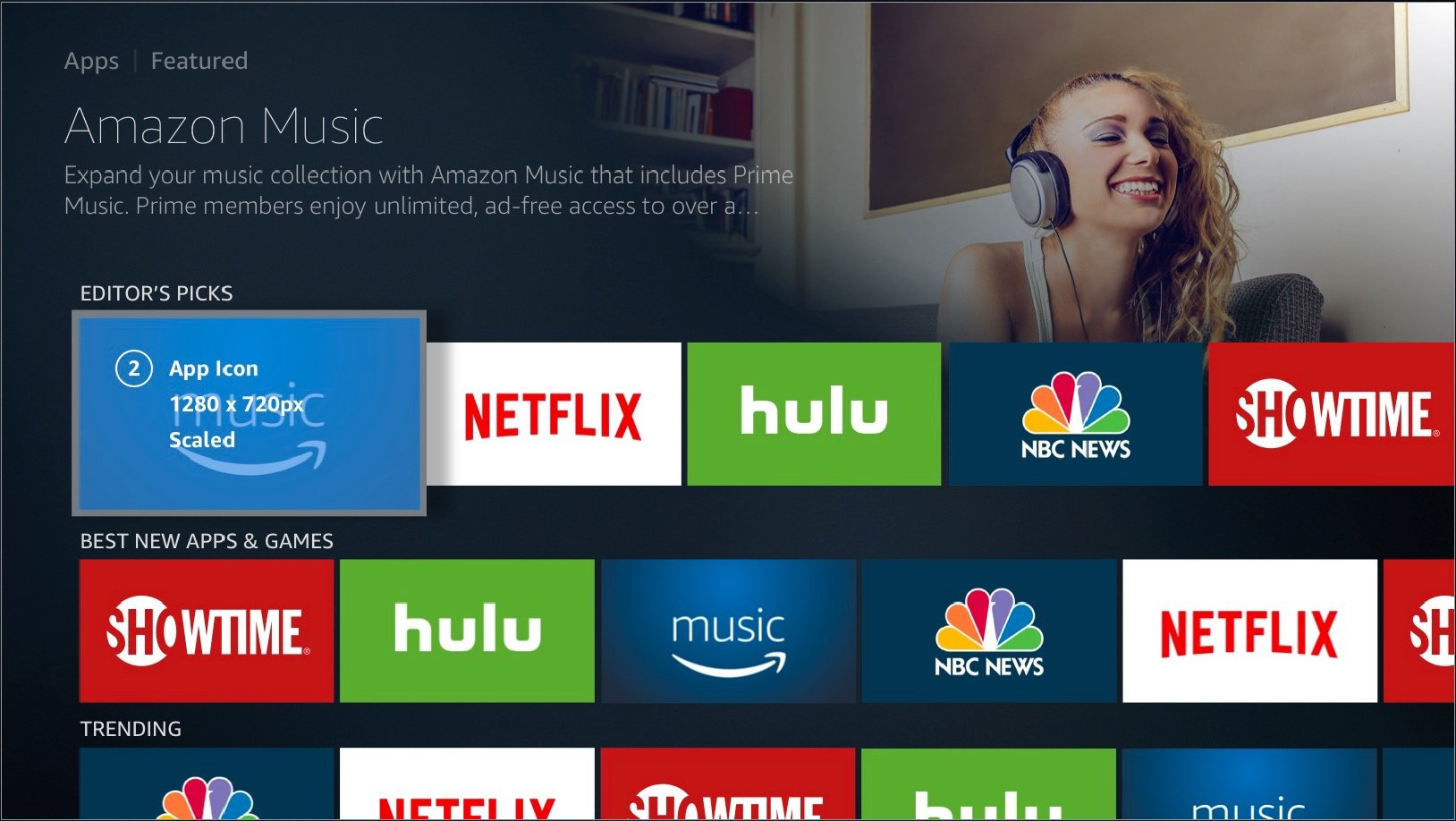
The App Icon shown highlighted in the context of the App Store

The App Icon in the context of the App Store
Safe Zone
To ensure your App Icon looks good even with badging (download icons, progress bars, etc.), place your main subject and title art within the content safe area. Artwork that falls outside of the safe area may be covered by badges.

App Icon with Badging
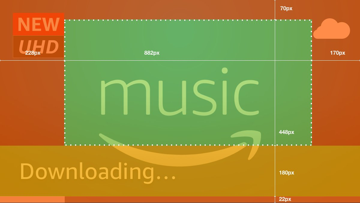
App Icon displaying safe zones
- Orange: Imagery may be obscured by opaque badging elements.
- Yellow: Imagery may be obscured by translucent or typographic UI elements.
Imagery is safe. - Green: The 882 x 448px area represents where the main subject and title art are safe
Background Image
Resolution 1920x1080 | Format JPEG | Transparency No
When users scroll across your app from a browse page, the Background Image appears in the upper-right corner of a mini-detail page.
Best Practices
- Cinematic - use imagery that is engaging and has a pleasing composition
- Relevant - use imagery that is relevant to the app experience, don't show a person using the app, the controller, the TV, or the surrounding room, just show the app itself
- Different - when possible, use different imagery than the app icon
- Character-centric - use imagery that includes major characters or notable content, use the safe zones to verify placement of heads and faces
- Logos and Titles - logos and titles should not be in the background
- Busy - do not use imagery that has too many subjects or fine detail
- Subject Right - the main subject should be to the right side of the image when possible as the UI may obscure it on the left
- Other Platforms - Amazon Appstore offers many apps that also exist on other platforms (smartphones, tablets, competitor devices), assets should reflect the experience of the app on Fire TV
Example

Example Background Image
Context
The Background Image appears on Fire TV in two contexts, the App Store and the App Store product page.
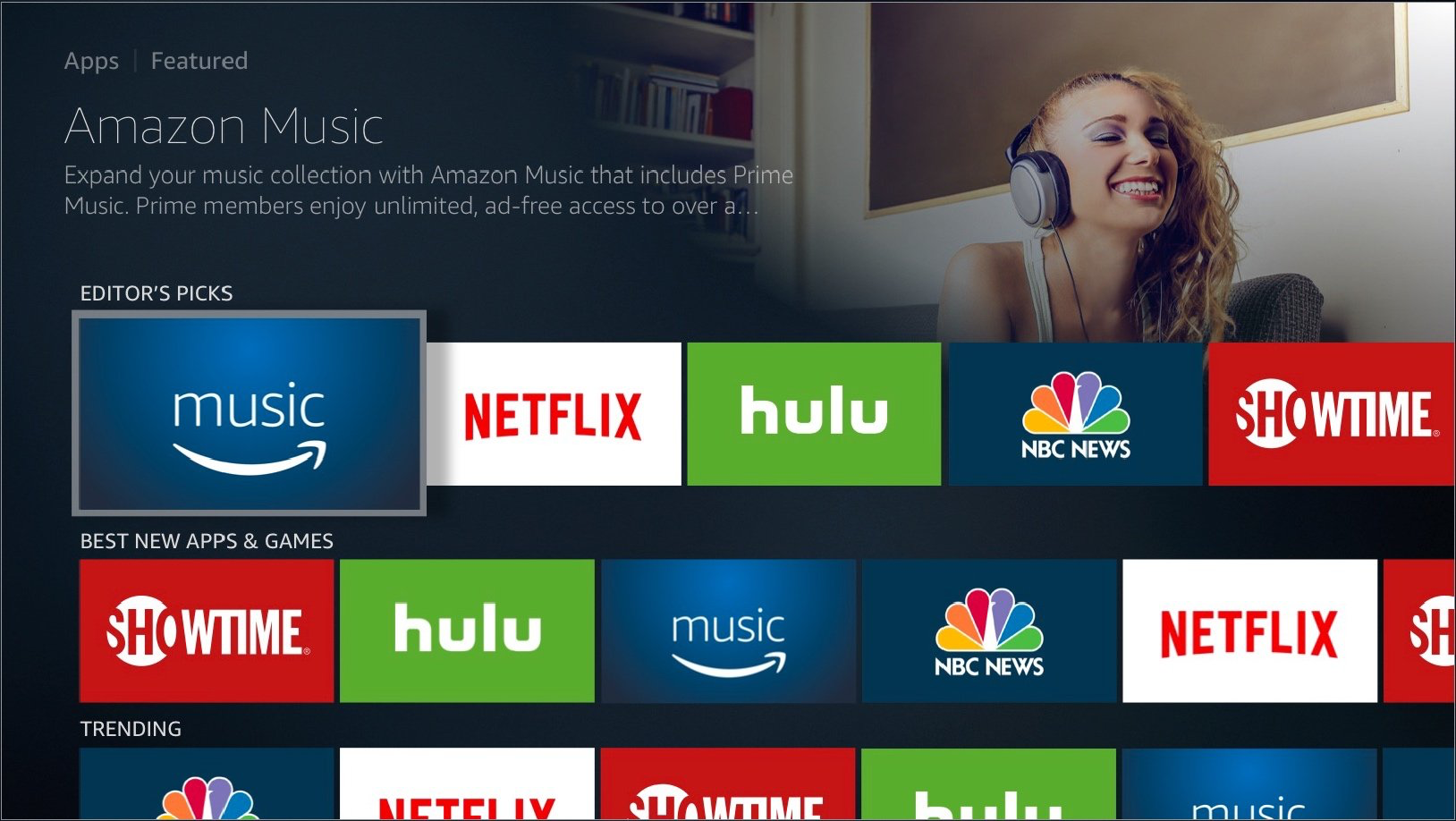
The Background Image in the context of the App Store](https://files.readme.io/0222060-image.png)
The Background Image shown highlighted in the context of the App Store

The Background Image in the context of the App Store
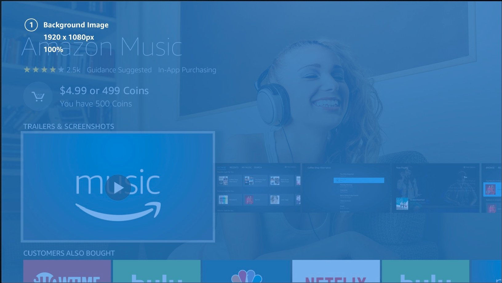
The Background Image shown highlighted in the context of the App Store when on the app page
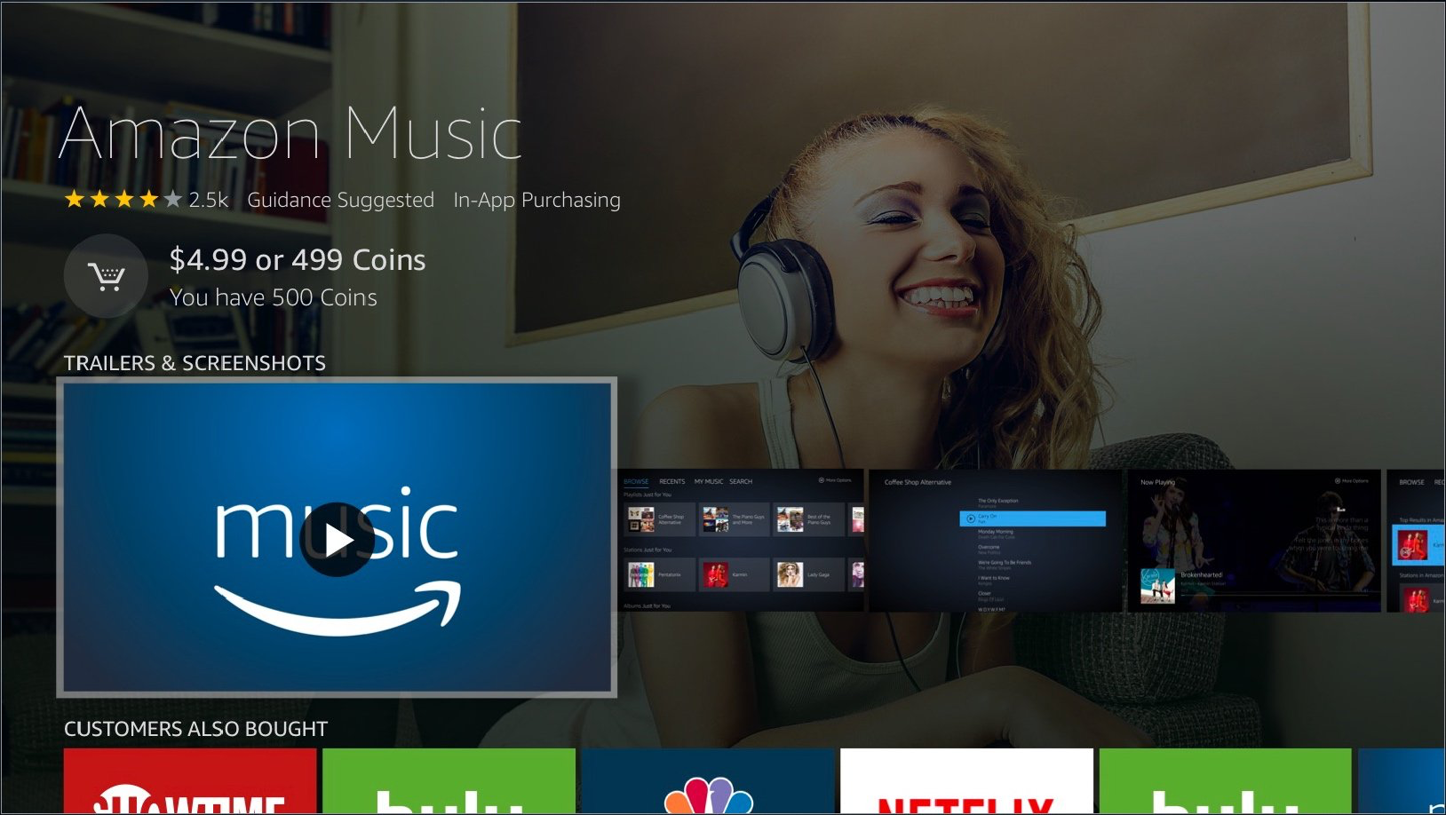
The Background Image in the context of the App Store when on the app page
Safe Zone
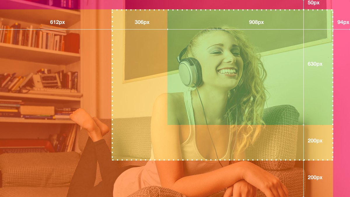
Background Image displaying safe zone
- Red: Imagery may be obscured by opaque elements.
- Orange: Imagery may be obscured by translucent or typographic UI elements.
- Green: The 1214 x 830px area represents where the main subject of the image should be placed.
Updated 6 months ago
