Apple TV Submission
This page provides an overview of Apple TV submission process
Typical Review Time
Apple review typically takes to take in the region of 3-10 working days
Text
App title
The name of your app
Promotional text
Promotional text lets you inform your App Store visitors of any current app features without requiring an updated submission. This text will appear above your description on the App Store for customers with devices running iOS 11 or later, and macOS 10.13 or later.
- 170 chars
Long description
A description of your app, detailing features and functionality
- 4000 chars
Keywords
- 100 chars (including commas/spaces between words)
Imagery
Summary of Required Imagery
| Usage | Resolutions | Format | Layered |
|---|---|---|---|
| App Icon | 400x240, 800x480, 1280x768 | PNG | Yes |
| Top Shelf | 2320x720, 4640x1440, 1920x720, 3840x1440 | PNG | No |
App Icon
Resolutions 400x240, 800x480, 1280x768 | Format PNG | Layered Yes
The app icon for tvOS is crafted as a multi-layered image, prominently visible on the Home Screen and within the App Store. These icons are leverage multiple layers to create an immersive sense of depth and dynamism, particularly when users focus on them. Employing multiple layers allows the icon to feature a compelling parallax effect, enhancing its visual depth and engagement.
For each resolution, a minimum of two layers (images), including a background and a foreground, must be provided. The design accommodates up to a maximum of five layers, offering further creative possibilities.
To visualise and fine-tune the layering effect for your icon, the Parallax Photoshop Plugin is available, enabling a preview of the layered composition.

The app icon as seen on the Home Screen
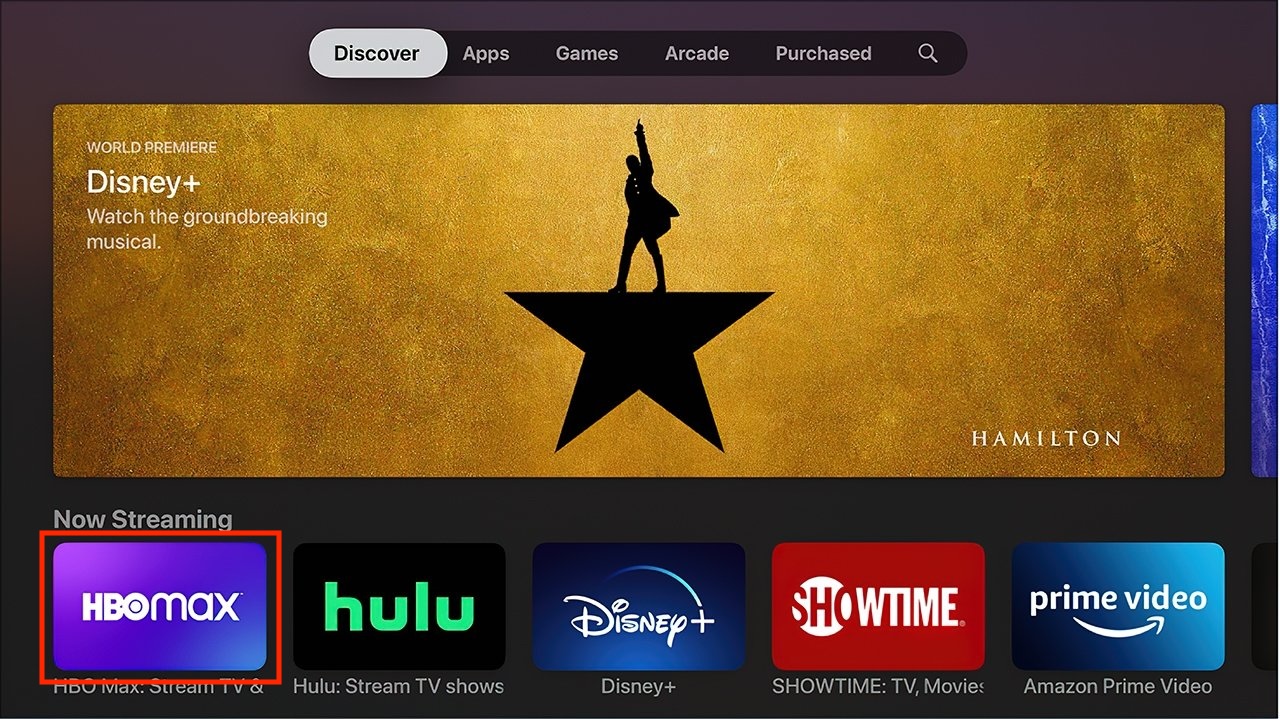
The app icon as seen in the App Store
Best Practices
Prioritise Simplicity: Opt for simple icons that are easy to understand and recognise. Capture the essence of your app or game in a straightforward, unique way. Avoid excessive details that can muddy the icon, particularly at smaller sizes. Emphasise a simple background that directs focus to the primary image without overwhelming the icon.
Limit Text to Essential Elements: Incorporate text only when integral to your app's experience or brand. Small text in icons can clutter the design and hinder readability. Consider that app names often accompany icons, reducing the necessity for text within the icon itself. While a mnemonic like the initial letter of your app's name aids recognition, avoid unnecessary directives like "Watch" or "Play," or context-specific terms such as "New" or "For tvOS."
Prefer Graphics Over Photos and UI Replication: Graphic images are more suitable for icons than photos due to their clarity at smaller sizes. Create visual representations that highlight your app's features effectively. Avoid replicating standard UI components or utilising app screenshots in your icon, especially if they are closely associated with your app's interface.
Design as Full-Bleed Square Image: For tvOS layered app icons, utilise full-bleed square images, primarily for the bottom layer. Access downloadable production templates from Apple Design Resources for platform-specific icon creation.
Avoid Apple Product Replicas: Steer clear of replicating Apple hardware products in your app icons, as they are copyrighted materials.
Layer Separation and Depth: Separate logos from the background within your icon design. Ensure text elements are positioned prominently to avoid hiding behind other layers during the parallax effect, offering clear visibility.
Exercise Caution with Gradients and Shadows: Background gradients and vignettes might conflict with the parallax effect. Prefer top-to-bottom, light-to-dark gradients and use sharp, hard-edged shadows integrated into the background layer, ensuring they're not visible when the icon is stationary.
Utilise Opacity for Depth and Dynamics: Employ varying opacity levels strategically to add depth and vitality to your icon. Consider using translucent layers, like the Photos icon, to enhance the design's liveliness.
Adhere to Safe-Zone Specifications: As the system may crop content during focus and parallax effects, ensure your icon's content doesn't get cropped excessively by leaving additional breathing room around the edges, adhering to safe-zone specifications.
Maintain Opaque Backgrounds: Ensure the background layer remains fully opaque to avoid errors and ensure compatibility with parallax, shadows, and system backgrounds.
Keep Layering Subtle: Embrace simplicity in layering to create a natural and pleasing depth effect without overwhelming visuals or appearing unrealistic.
Safe Zone
Content along the edges of certain layers might be cropped or less visible during focus and parallax movements as the image scales and shifts. To ensure clear visibility of your main content, maintain a safe distance from the edges. Note that the safe zone's dimensions can vary based on image size, layer depth, and motion, with foreground layers subject to more cropping than background layers.
An example of the safe zone for the Podcasts icon on tvOS
Consider both the unfocused and focused states to determine the ideal size for a layered image. Background layers might experience slight cropping during the parallax effect. Therefore, it's advisable to keep crucial content within a safe zone and allocate additional space for optimal visual presentation.
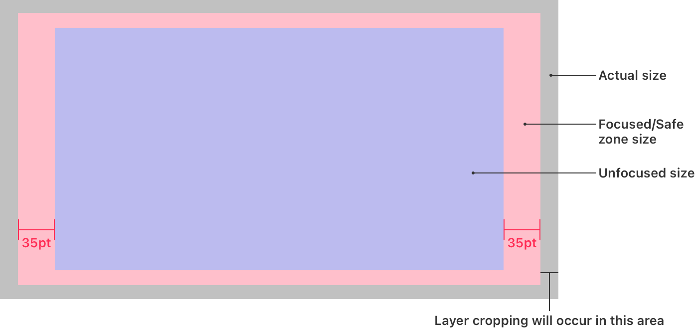
The safe zones for a tvOS icon
Utilize the following formulas to calculate the appropriate sizing for a layered image based on its dimensions when not in focus.
| Image Side | Focused/Safe Zone Size | Actual Size |
|---|---|---|
| Longest | Length of longest unfocused side + 70 pt | Length of longest focused side x 106% |
| Shortest | Proportional based on longest side | Proportional based on longest side |
Example
Displayed here is the settings icon on tvOS, crafted with five distinct layers.
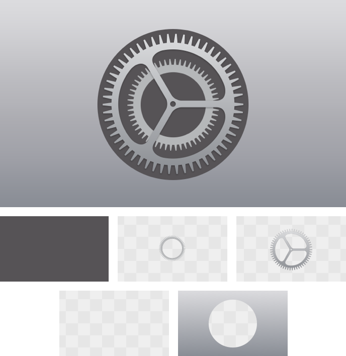
The different layers of the Settings icon on tvOS
Top Shelf Image
Resolutions 2320x720, 4640x1440, 1920x720, 3840x1440 | Format PNG | Layered No
The system showcases a static image referred to as the top shelf image when your app is in the Dock and in focus. When transitioning to the app, tvOS employs a flipping and blurring effect on the image.
Best Practices
Steer clear of suggesting interactivity within a static image. A static Top Shelf image lacks focusability, and it's essential not to mislead users into thinking it's interactive.
Updated 8 months ago