Pages
Pages allow you to lay out your content for the customer to browse.
There are currently two types of pages. Flex Pages and Info Pages. In the guide, we will focus on Flex Pages and refer to them simply as Pages
You can create as many Pages as you like. On each Page, you can add collections and banners and then define how they are presented to the user (i.e. in a row of content, and grid, large or small images).
Creating a page
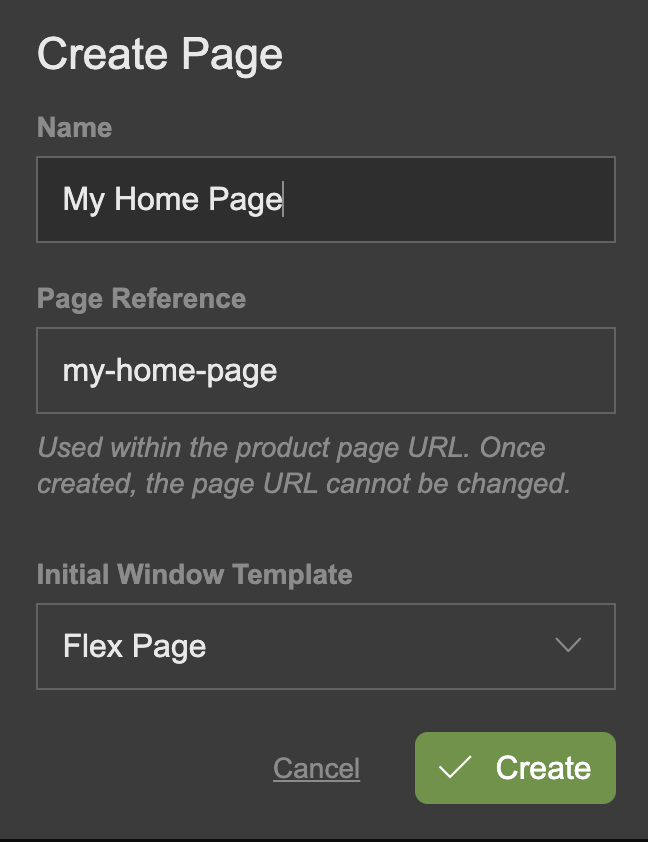
- From the Content menu on the left, select Pages to expand it and click the + button.
- In the subsequent dialogue overlay add a name for you page. You can update the name later.
- As you type the page name, the Page Reference name will be auto-complete to match the Page Name, in the required format. You can edit this reference name now, but once you have created the page, you will no longer be able to amend it.
- In the Intial Window Template drop down select menu, ensure Flex Page is selected
- Click Create
The Page Reference can be edited before creating a Page, but it can not be amended once the Page has been created.
Content Windows
For information on using Content Windows, please reference Content Windows
Name and Description
- Click the Name and Description section to expand it.
- Click Name to edit the text value.
- Click Short Description to enter text for a short description (optional).
- Click Long Description to enter text for a long description (optional).
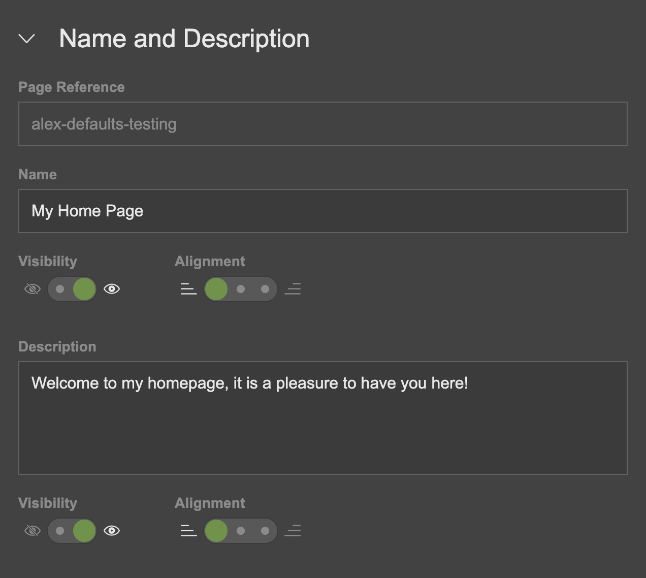
You can also edit the page name by clicking the edit (pen) icon to the right of the large name at the top of the page.
Age Ratings
Existing age ratings can be applied to pages. These can be used to affect when and if a speed-bump is displayed.
- Click the Age Ratings section to expand it.
- Existing age rating sets will be listed.
- Clicking an age rating set will expand it and reveal all the age ratings which belong to that set.
- Select an age rating from a set to apply it to the page.
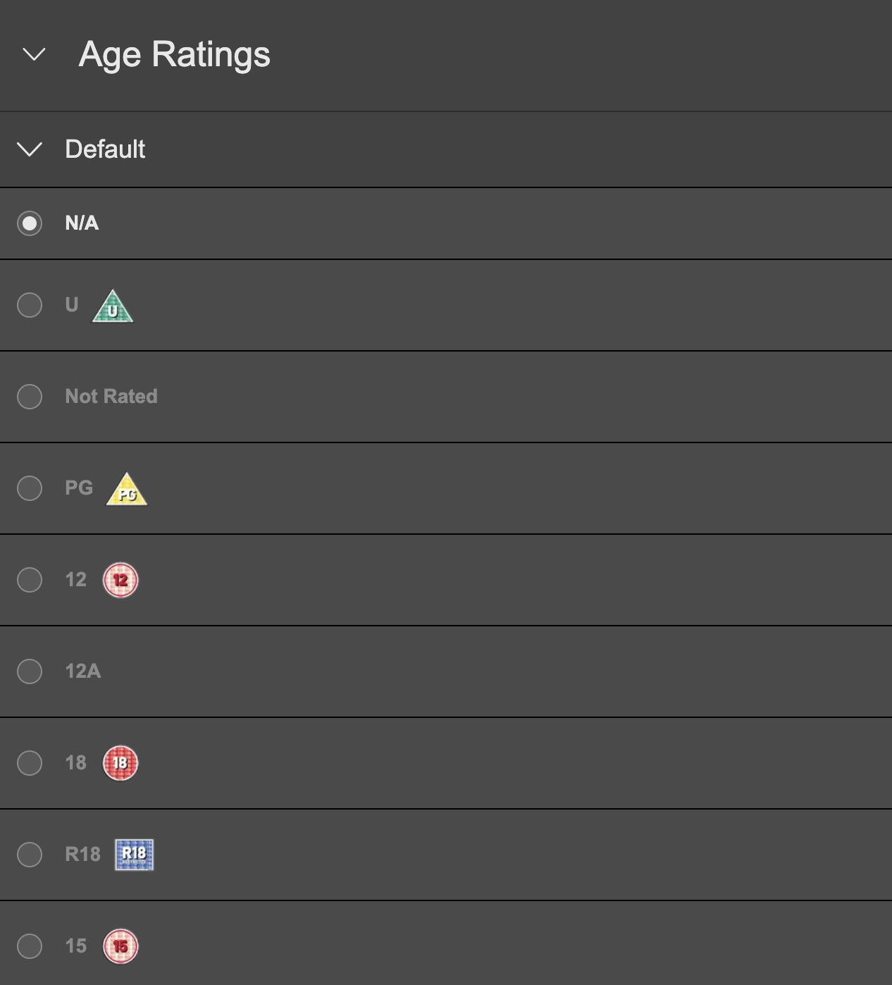
You can apply one age rating from each age rating set. Each age rating set is usually targeted at a different market, enabling you to apply a different age rating for each market.
See the Age Ratings section for a guide to creating age ratings.
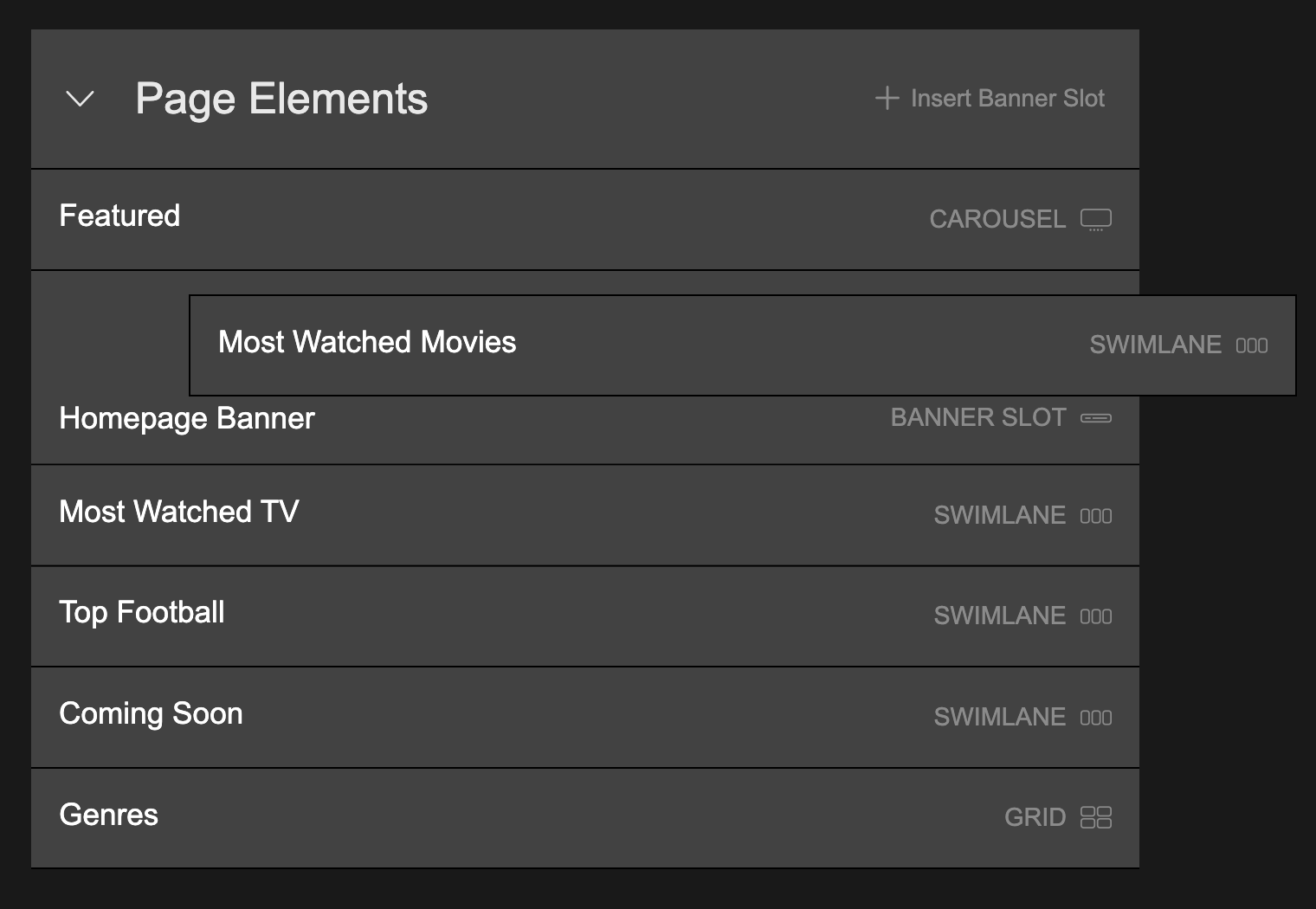
Page Elements
Page Elements are the collections and banners which are displayed on your page. You can add them to the page in the order you would like them to be displayed and define the style of each element.
To get started, click the Page Elements section to expand it:
Adding a Collection to a Page
- In the Content menu on the left, click Collections to reveal the list of existing collections.
- Grab a collection of choice and drag and drop it onto the Page Elements drop zone (or in between existing Page Elements).
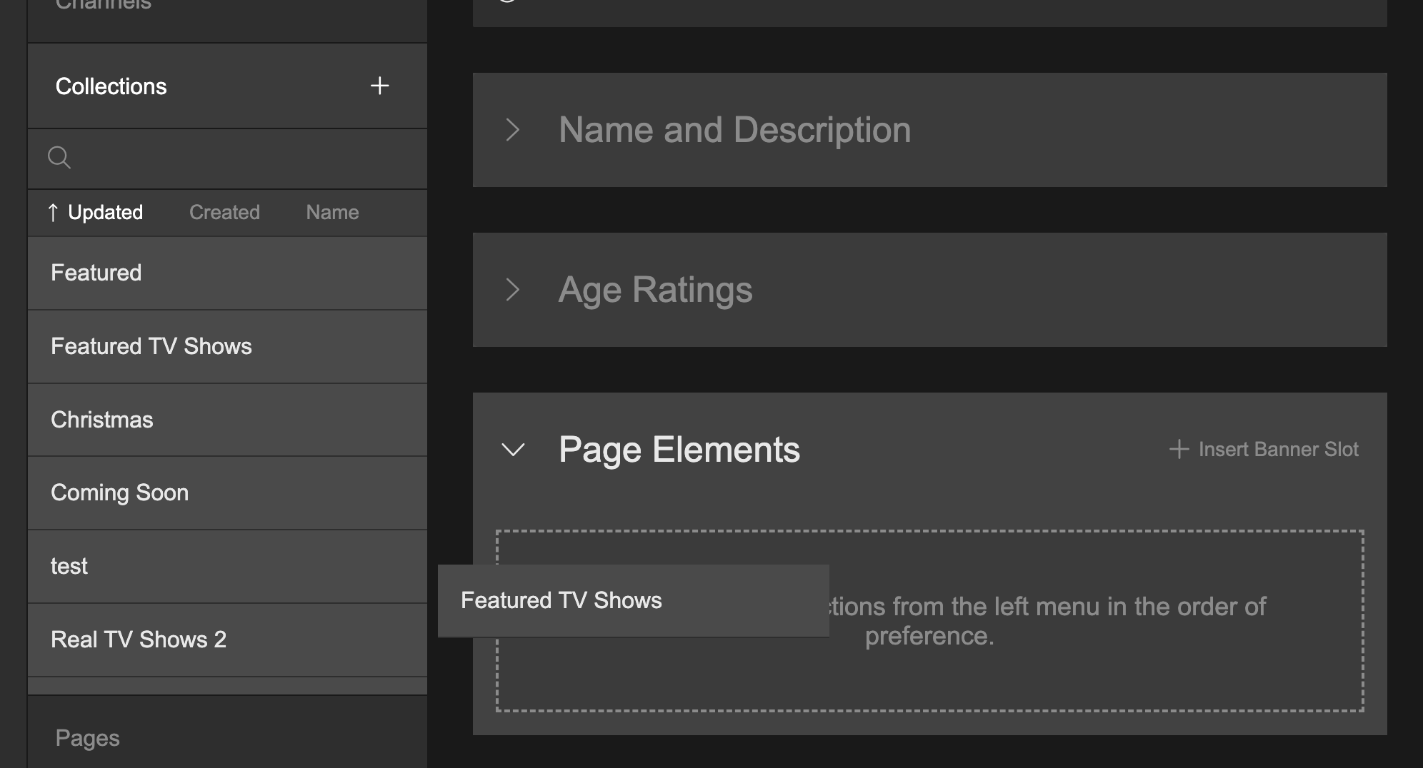
When a collection is added to the Page Elements list, it uses the Swimlane style by default. You can change this at anytime.
Adding a Banner Slot to a Page
A Banner Slot is like an empty billboard, waiting for an actual banner ad to be attached to it.
- At the top right of the Page Elements section, click + Insert Banner Slot
- A Banner Slot is added to the top of the list of Page Elements.
Reordering the List of Page Elements
- Grab a collection or banner slot in the list of Page Elements.
- Drag and drop it into a new position in the list.
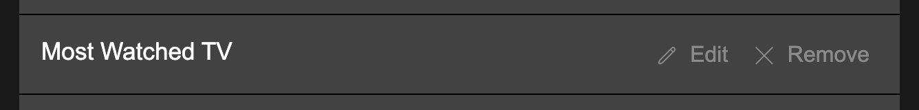
Removing a Page Element
Mouseover a page element and click the subsequent Remove button.
Defining Collection Styles
- Mouseover a collection in the Page Elements list and click Edit.
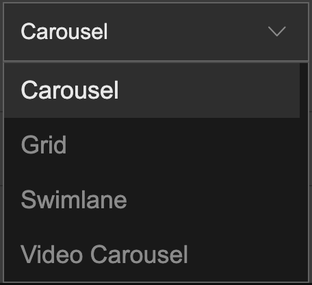
- In the subsequent panel overlay, you can change the collection element type by click the drop down select menu:
- Swimlane: A row of content
- Carousel: A large row of content, which automatically slides right to left on consumer websites. These are often placed at the top of a page.
- Video Carousel: Similar to a Carousel, but the Video Carousel auto-plays a trailer, one after the other, for the products in the Carousel collection.
- Grid: A grid of content.
Collection Settings
- Name (the name of the collection)
- Visibility: Flip the switch between show/hide
- Alignment: Define the alignment of the name, from left/centre/right
- Description (the description of the collection)
- Visibility: Flip the switch between show/hide
- Alignment: Define the alignment of the description, from left/centre/right
- Navigation Indicator - ONLY for Carousels and Video Carousels (the dots which appear beneath the Carousel)
- Visibility: Flip the switch between show/hide
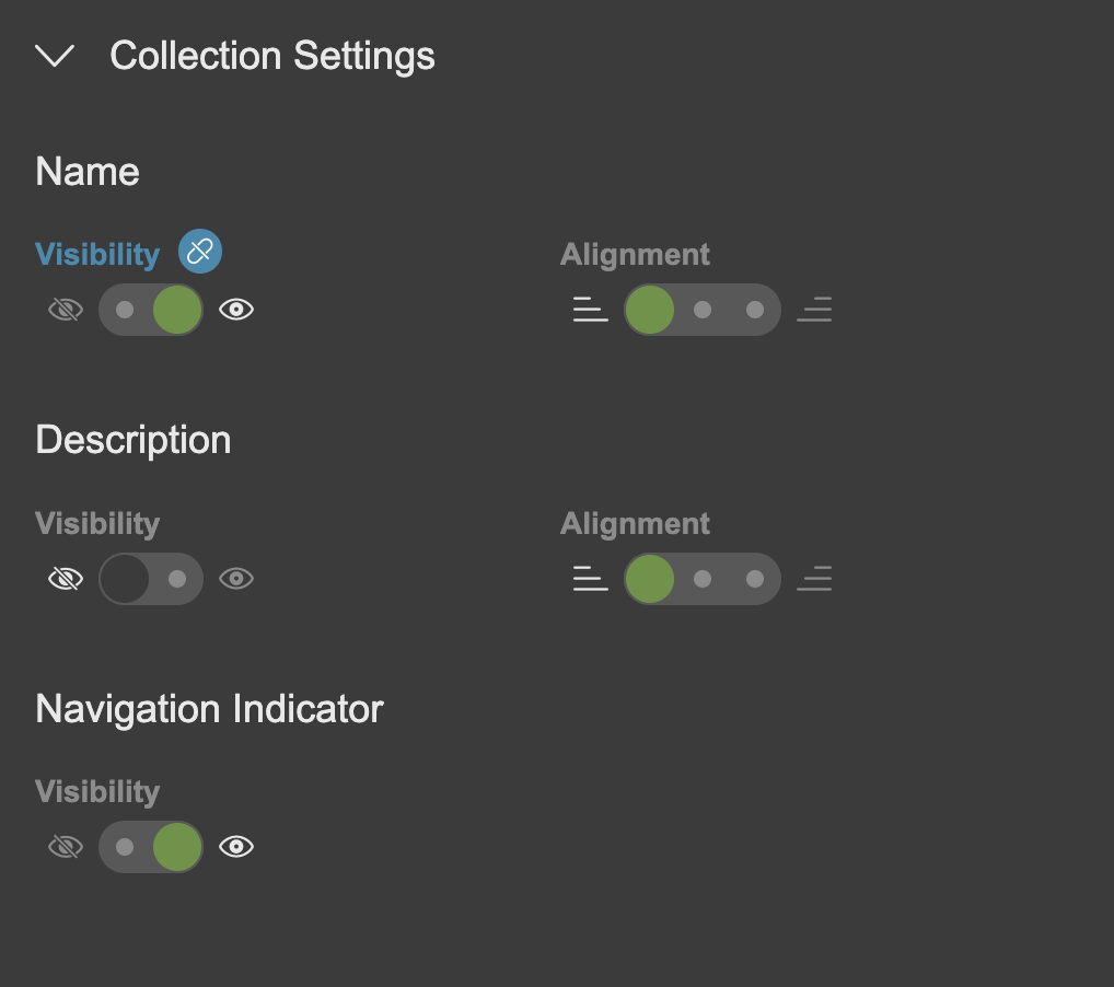
When altering a setting, it typically supersedes the corresponding default in Global Settings. If so, the title becomes blue and displays a 'broken link' icon. Hover over this icon and click Reset to revert to the default setting.
Tile Settings
Each tile represents a product or nested collection and features an image and some metadata. You can define the visual style of the tile and which metadata should be displayed beneath the image.
- Name (name of product or nested collection)
- Visibility: Flip the switch between show/hide
- Alignment: Define the alignment of the name, from left/centre/right
- Description (short description of product or nested collection)
- Visibility: Flip the switch between show/hide
- Alignment: Define the alignment of the name, from left/centre/right
- Image
- Corner: Select between squared or rounded corners.
- Image ratio: Carousel options: 16:9/21:9, Swimlane and Grid: 2:3/4:3/16:9
- Auto Play (for Video Carousels only)
- Trigger: Define whether the video trailer auto-plays when the customer passes focus to the Video Carousel, or when the Video Carousel comes into view on the page.
- Audio: Define whether the trailer audio is muted or plays by default.
- Focus (define the style of the tile image when it is focused. Note, some apps do not adhere to this setting and use their own native style)
- Shadow: Flip the switch to active or non-active
- Border: Flip the switch to active or non-active
- Progress Bar
- Visibility: Flip the switch between show/hide
- Duration
- Visibility: Flip the switch between show/hide
- Display Seconds Flip the switch to active or non-active (if active, the duration will display minutes and seconds (useful for short videos). If non-active, the duration will display minutes only (useful for long videos).
- Published Date (the date the product or nested collection was added to the service)
- Visibility: Flip the switch between show/hide
- Age Rating
- Visibility: Flip the switch between show/hide
- Release Date (the year the product was released)
- Visibility: Flip the switch between show/hide
- On Select (what happens when the user selects a tile product)
- Play feature video: Flip the switch between active and not-active. If active, the product feature video will play (if the customer has an entitlement). If not-active, the customer will be taken to the product/collection page.
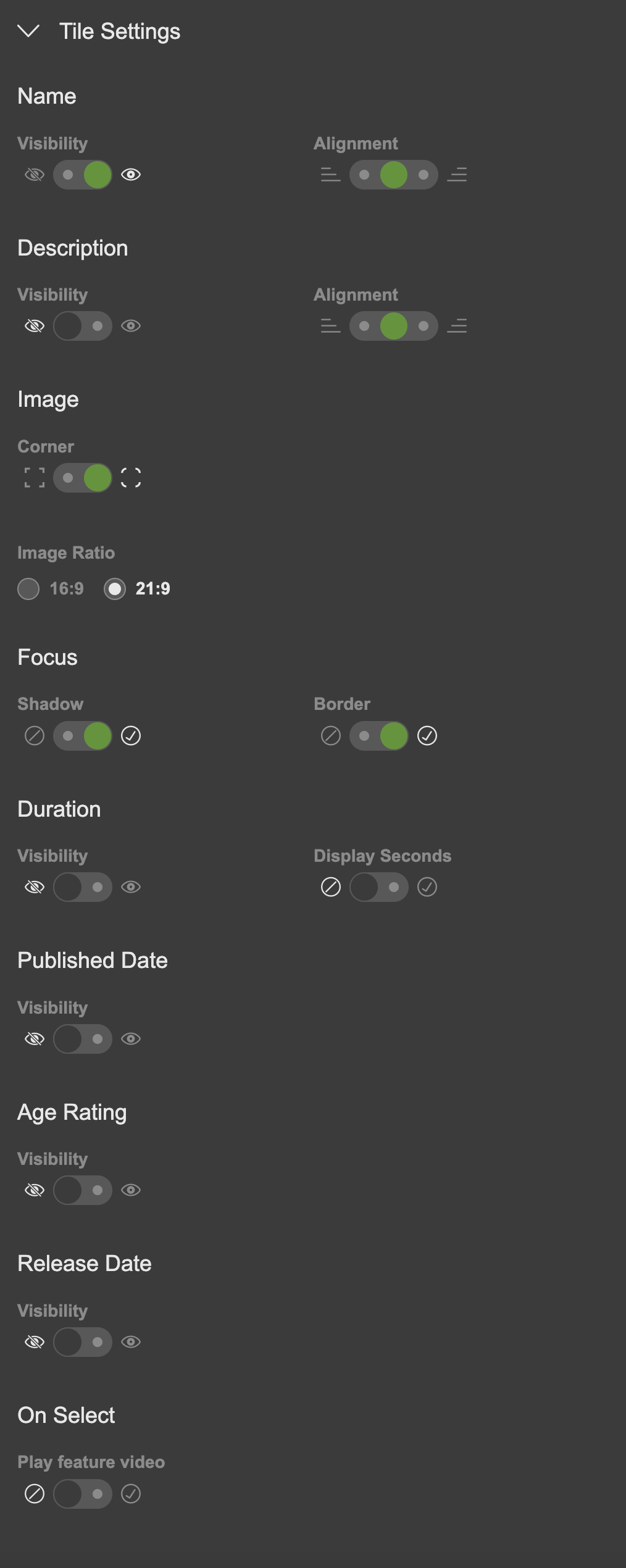
When altering a setting, it typically supersedes the corresponding default in Global Settings. If so, the title becomes blue and displays a 'broken link' icon. Hover over this icon and click Reset to revert to the default setting.
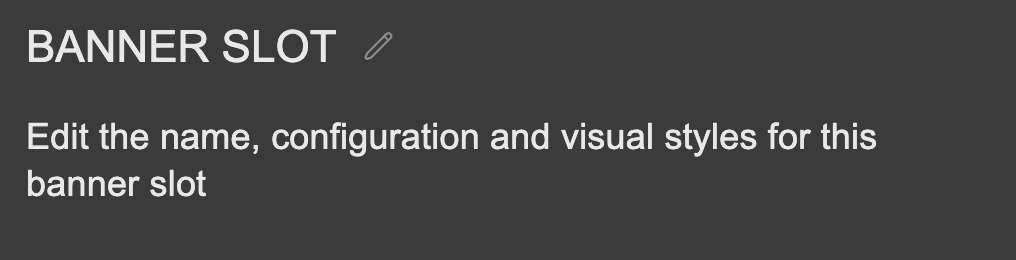
Defining Banner Slots
You can define the style and settings of a Banner Slot so that the correct banner(s) can target it and are displayed the way you would like.
Mouse over a banner slot and click Edit. This will display the Banner Slot panel.
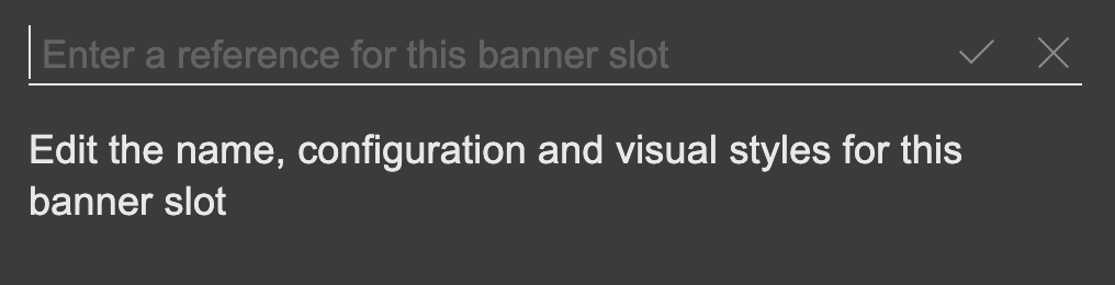
Banner Slot Name
Changing the Banner Slot name is useful if you have multiple Banner Slots and need to discern between each one.
- Click the pen icon to the right of the Banner Slot name (which is BANNER SLOT by default).
- You can now add a new Banner Slot name.
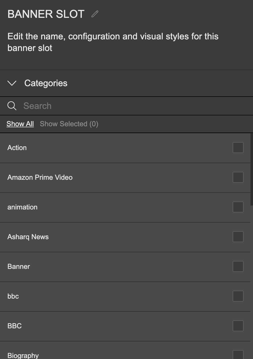
Categories
We use categories to enable Banner Ads to find their way to Banner Slots. Add one or more categories to your Banner Slot. Any Banner Ads which feature a matching category will be queued to display in the banner slot.
- Click Categories to reveal a list of existing categories
- Select the check box to the right of each category to add it to the banner slot. You can add one or multiple categories
- You can search for a particular category by clicking on the Search text field and entering the name of the Category you are looking for. The list of available categories will filter to match your keyword.
- You can filter between seeing all the available categories, or only the ones you have selected:
- Click Show All to see all available Categories
- Click Show Selected to see only the Categories you have selected. Note the counter to the right of the Show Selected button. This indicates how many categories you have selected.
Banner Style
Define the style of you banner, including the size.
- Click Banner Style to reveal the available style options.
- Page Margin (whether the banner is displayed with page margins to the left and right of it, or whether the banner stretches all the way to the edges of the page)
- Flip the switch between active or non-active
- Corner Style
- Switch between squared corners or rounded corners. Note, the switch will be forced to squared corners if you have set page margin to in-active)
- Parallax Scrolling (displays a parallax effect on your banner when the customer scrolls the page. Note, this effect is not yet supported by our apps)
- Flip the switch between active or non-active
- Size (define the size of the banner)
- Select between Small / Medium / Large / Extra Large
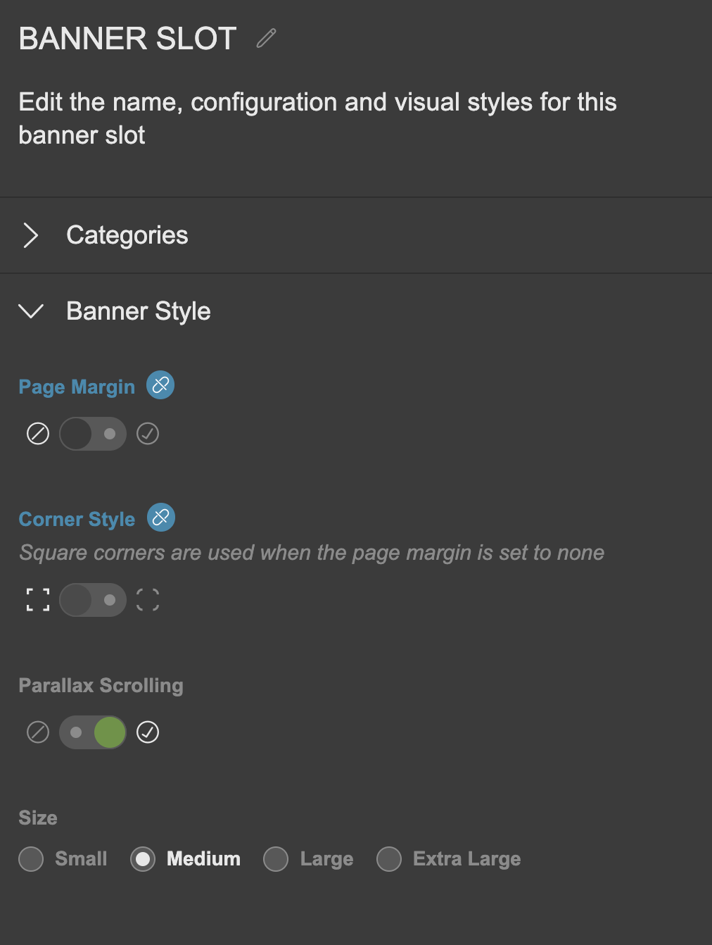
When altering a setting, it typically supersedes the corresponding default in Global Settings. If so, the title becomes blue and displays a 'broken link' icon. Hover over this icon and click Reset to revert to the default setting.
See Banners for a full guide on creating and targeting internal banners.
Updated 8 months ago