Android TV Submission
Typical Review Time
Google review typically takes to take in the region of 3-10 working days
Text
App title
The name of your app
- 30 chars
Short description
A short description for your app. Users can expand to view your full description.
- 80 chars
Long description
A description of your app, detailing features and functionality
- 4000 chars
Imagery
Summary of Required Imagery
| Usage | Size | Format | Adaptive |
|---|---|---|---|
| Launcher Icon (App Icon) | 512x512 | PNG | Yes |
| Banner Icon | 640x360, 1280x720 | PNG | Yes |
| Feature Graphic | 1024x500 | JPEG | No |
Launcher Icon (App Icon)
Resolution 512x512 | Format PNG | Adaptive Yes
The launcher icon is the visual representation of your app that appears both in the Google Play Store and within the Android TV settings. It essential for establishing brand recognition and enticing users to engage with your app in store browsing.
Adaptive launcher icons offer increased flexibility, allowing for captivating visual effects in app icons. This feature utilises two distinct layers—a foreground and a background layer—each requiring separate images to compose your app's icon.
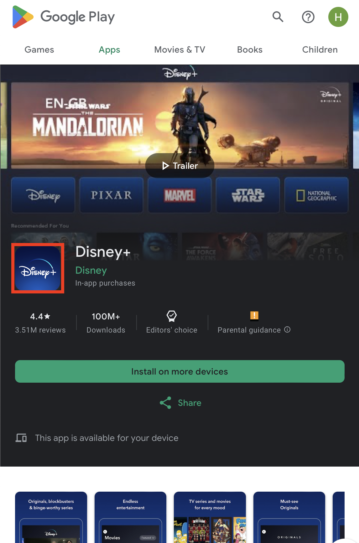
The launcher icon on Google Play
The launcher icon in the Android TV settings
Best Practices
Adhere to Guidelines: Ensure compliance with guidelines by keeping the logo within the designated safe area for optimal presentation.
Avoid Additional Information: Refrain from using text or graphic elements to convey supplementary details, maintaining clarity and simplicity.
Prevent Misleading Elements: Avoid incorporating text or graphics that might confuse or mislead users regarding the app's functionality or purpose.
Contain Within Safe Area: Ensure the logo remains within the safe area to maintain its integrity and prevent any elements from spilling out, guaranteeing a complete and coherent visual representation.
Borderless Design: Exclude borders around the logo to prevent potential cropping issues that can lead to a less polished visual appearance.
Maintain Original Shape: Preserve the original shape of the logo without rounding corners or cropping edges, ensuring a consistent and professional visual identity.
Safe Zone
The safe zone within the launcher icon spans 340x340 pixels, positioned at the center. This designated area ensures that essential visual elements remain unobstructed and clearly visible. Placing critical design components within this zone guarantees optimal display across various screen sizes and resolutions, both in the Google Play Store and within the Android TV settings.
The safe zone of the launcher icon
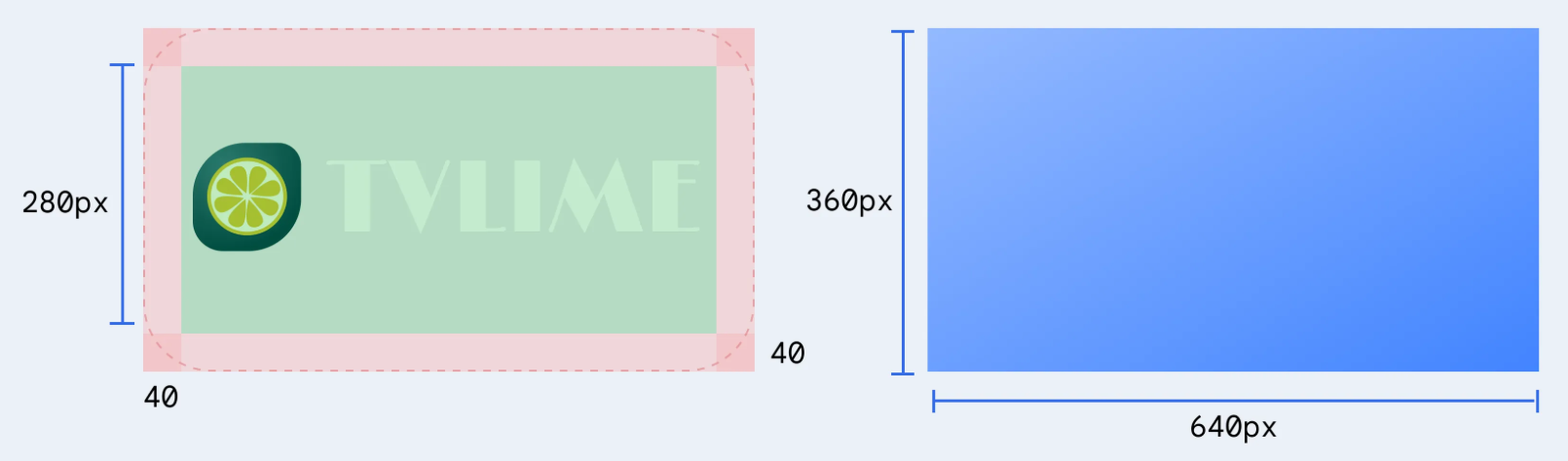
Banner Icon
Resolution 640x360 | Format PNG | Adaptive Yes
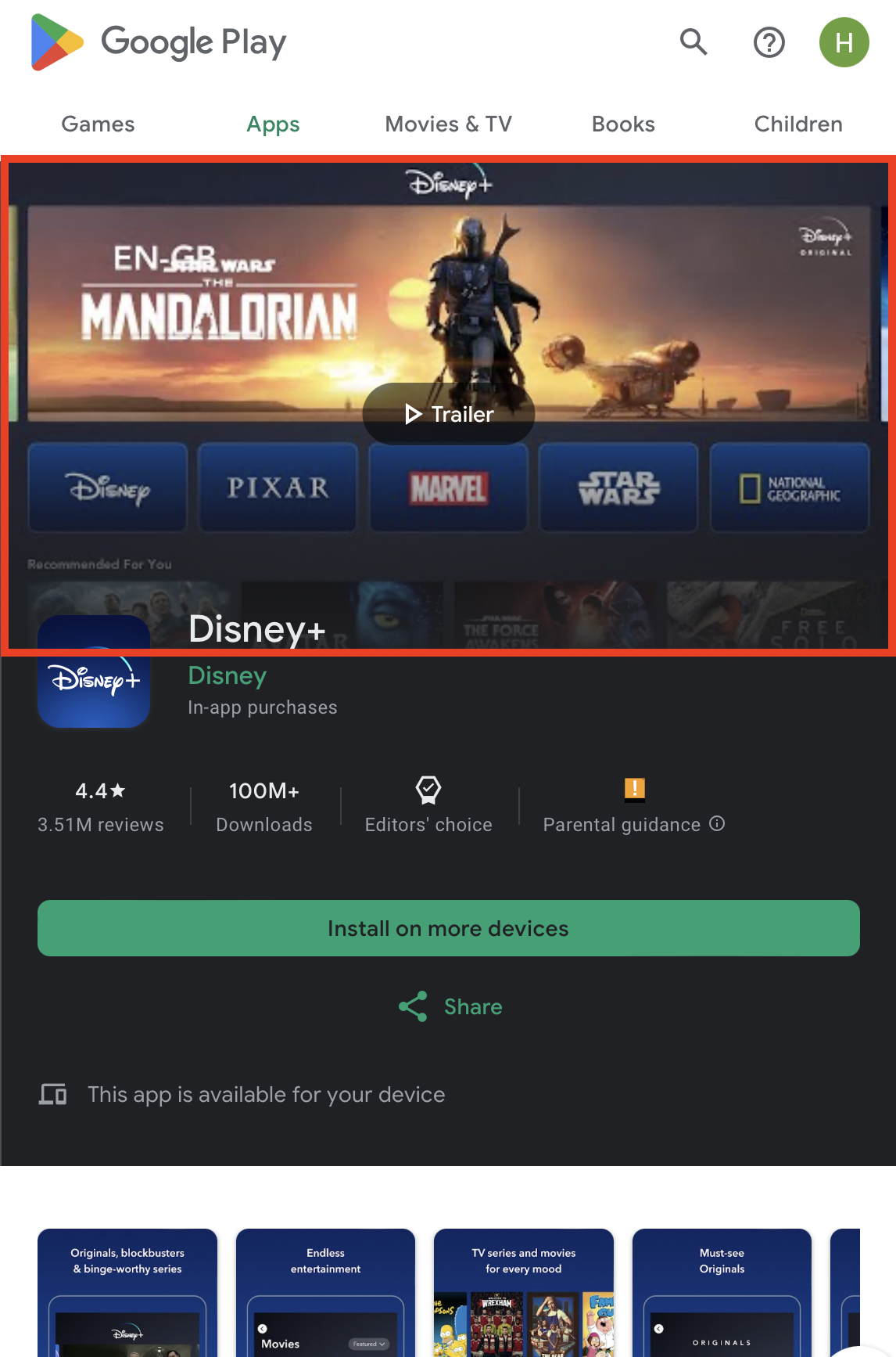
The banner logo serves as the primary visual representation of your app within various sections of the Android TV interface, including 'For You', 'Apps', and search results. It's showcased across the platform, ensuring visibility and recognition as users navigate through different sections, enhancing the app's presence and accessibility within the Android TV ecosystem.
Adaptive banner icons offer increased flexibility, allowing for captivating visual effects in app icons. This feature utilises two distinct layers—a foreground and a background layer—each requiring separate images to compose your app's icon.
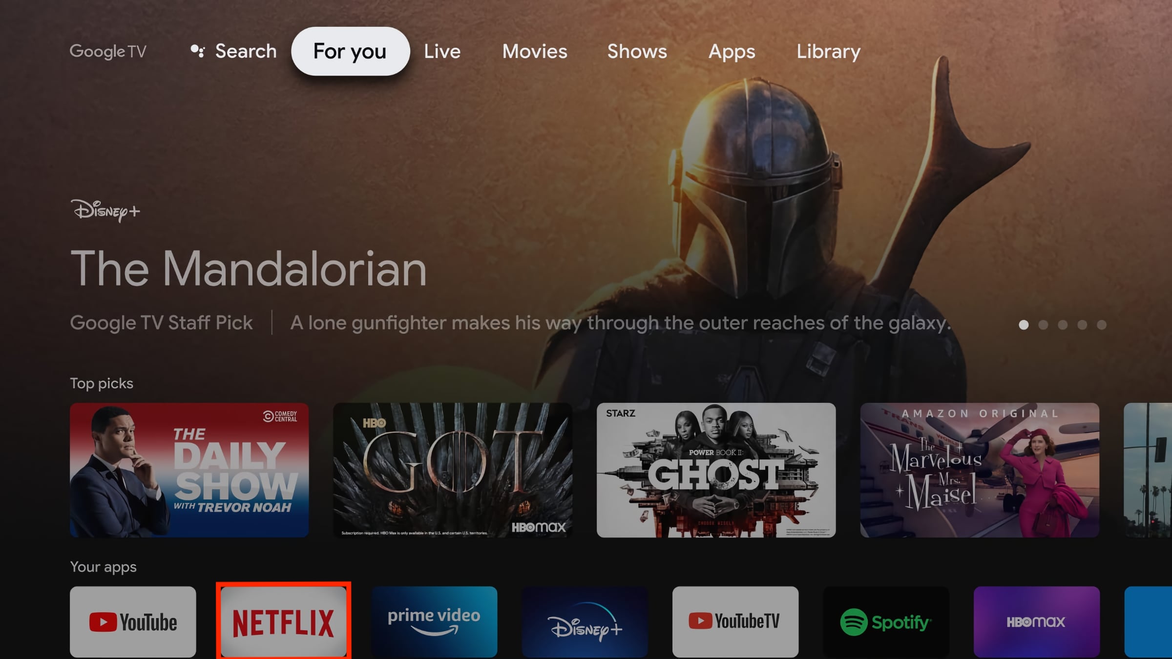
The banner icon on the 'For you' page on Android TV
Best Practices
Comprehensive Brand Representation: Incorporate your full logo, comprising both the icon and accompanying text, to ensure clear brand representation within the banner.
Guideline Adherence: Adhere strictly to the guidelines provided, ensuring that the logo remains within the designated safe area for optimal display.
Clarity without Additional Information: Refrain from using text or graphic elements to convey additional information, maintaining clarity and preventing potential confusion among users.
Avoid Misleading Elements: Steer clear of employing text or graphics that might mislead users regarding the application's functionality or features.
Border-Free Design: Do not include borders around the logo, as they can be subject to cropping, resulting in visually unrefined aesthetics.
Maintain Original Shape: Preserve the original shape of the logo without rounding corners or cropping edges to ensure a polished and consistent visual appearance.
Safe Zone
The safe zone within the banner icon measures 560x280 pixels, positioned at the centre to ensure optimal visibility and clarity for your logo. Placing crucial design elements within this designated area helps maintain their integrity and ensures they remain unobstructed.
Feature Graphic
Resolution 1024x500 | Format JPEG | Adaptive No
The feature graphic serves as a compelling medium to showcase app or game experiences, effectively captivating and engaging potential users. It finds placement across various sections on Google Play. Firstly, it acts as the cover image for your preview video, whenever available. Additionally, for apps, a collection of applications is presented in a sizeable format, prominently featuring your feature graphic, including advertisements.
The feature graphic on Google Play on Android
Best Practices
Communicate App Experience: Utilise graphics that vividly portray app or game experiences while emphasising the core value proposition. If necessary, incorporate relevant contextual elements or storytelling components to enhance engagement.
Distinct Branding Elements: Avoid incorporating prominent branding that closely resembles your app icon to prevent duplication when displayed together. Optimise branding elements that serve as an extension of your app icon.
Simplicity over Fine Details: Refrain from overloading the graphic with intricate details, as they may not be discernible on various phone screens.
Centred Focal Point: Position prominent visuals and the focal point towards the centre of the graphic to attract attention effectively.

The focal point of the feature graphic
UI Overlay Compliance: Adherence to focal points and cutoff zones is crucial to maintain eligibility for certain formats utilising additional UI overlays.
Background Element Placement: Confine background elements to the graphic's edges to prevent overshadowing or distracting from essential content.
Vibrant Colour Usage: Utilise vibrant colours to evoke interest and excitement while avoiding pure white or dark grey, which might blend into the Play Store background.
Consistent Branding and Colour Scheme: Ensure consistency in the feature graphic, app icon, and app itself by employing a similar or complementary colour theme and style for immediate user association with your app and brand.
Localisation for Markets: Adapt graphic and branding text to suit different markets and languages for better resonance and understanding.
Avoid Specific Content: Refrain from incorporating content related to Google Play performance, rankings, user testimonials, accolades, pricing, or promotions that could become outdated or misleading.
Time-Sensitive Content Management: Swap out time-bound content, like holiday-specific updates, in a timely manner to prevent outdated information and maintain relevance.
Steer Clear of Inappropriate Elements: Avoid using third-party trademarked characters or logos without permission, device imagery that might become obsolete, or store badges or icons within the graphic.
Safe Zone
The safe zone, a critical area within the feature graphic, is a designated space measuring 716x350 pixels, positioned at the centre of the graphic canvas. This zone ensures that essential content remains unobstructed and fully visible, safeguarding crucial elements from potential cropping or distortion that might occur due to varying display sizes or stylistic adjustments. Adhering to the safe zone guidelines ensures that key information, visuals, and text crucial to the graphic's purpose and message remain intact and readily perceivable across different devices and viewing conditions on the Google Play Store.
The safe zone of the feature graphic
Updated 8 months ago