Page
Pages allow users to create, schedule, and target content tailored to different markets. Pages act as the equivalent of web pages or app screens and are made up of Page Elements, which are customisable components that define the content and layout of each Page. These elements range from simple text and images to dynamic video displays, giving users flexibility in presenting content. Pages can be accessed in various ways, including through menus, internal links, direct URLs, or deep links within apps.
Types of Pages
There are two primary types of Pages available: Info Pages and Flex Pages. Info Pages are designed for informational content and support layouts with either a single column or two columns. These Pages can hold one or two elements, such as text, images, or QR codes, making them ideal for presenting straightforward information like announcements, contact details, or promotional messages. In contrast, Flex Pages are more versatile and can contain any number of elements. They are typically used for media-heavy content, particularly videos. On Flex Pages, users can add a variety of elements, including video carousels, swimlanes, standard carousels, or grids, allowing for rich, immersive content experiences.
In addition to the more customisable Info and Flex Pages, the system also includes System Pages, which are predefined and linked to platform-wide features. These are often related to core functions, such as sign in, registration or search. While System Pages can be customized to a degree through the global configuration settings, they are less flexible than custom Pages. However, they can still be linked via system-generated links from other areas of the platform.
Configuration and Customisation
Both the layout and content of Pages are highly configurable. On a system-wide level, you can set global defaults that determine how Pages and their elements are displayed across the platform. At the same time, each Page can be individually configured to meet specific design or functional needs. This flexibility extends down to the element level as well, meaning you can adjust the behavior and appearance of individual elements (such as text blocks, images, or video carousels) on a per-page basis. This ensures that Pages can be tailored to fit both general content strategies and specific use cases.
Access and Navigation
Pages are accessible in several ways throughout the platform. They can be added to the site or app's main navigation menu, making them easily discoverable for users. Additionally, Pages can be linked from internal content items such as banners, footers, or product pages, providing multiple points of entry for users. Pages are also accessible via direct URLs on the web or through deep links in apps, enabling seamless navigation between content areas.
Scheduling and Targeting
An important feature of Pages is their ability to be scheduled and targeted. Pages can be set to appear at specific times, which is useful for time-sensitive content such as promotions, event announcements, or special offers. Additionally, Pages can be targeted to specific markets or user segments, allowing for personalized content delivery based on audience needs or regional preferences.
Page Elements
Flex Page
A Flex Page allows for greater versatility in content display, particularly suited for media-heavy layouts. These pages support a wide range of elements that can create dynamic, interactive experiences. Flex Pages are designed for scrolling and can accommodate multiple elements, giving users flexibility to arrange and present content based on their needs.
Elements
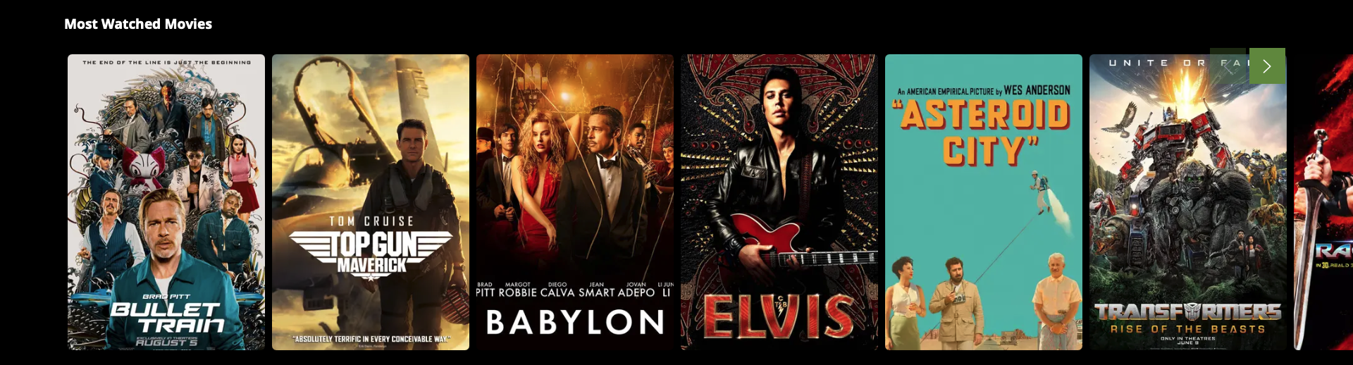
Swimlane
The Swimlane element is used to display collections or products in a scrollable, horizontal rail format. It is populated using a collection, which serves as the source for the items displayed within the swimlane. This element allows users to quickly navigate through various items without leaving the page. It is particularly useful for showcasing media or product collections in a compact and interactive format.
Collection Customisation
- Name & Description: Both the name and description of the collection can be customized, with options to adjust their visibility and alignment. This ensures that you can present relevant contextual information alongside the grid content.
Tile Customisation
- Name & Description: Each individual tile within the grid can also display its own name and description. Similar to collection settings, you can adjust the visibility and alignment of these elements.
- Image: You can customise how images within each tile are displayed, including the size of the image, choosing the corner style (rounded or sharp) and the image ratio (2:3, 4:3 or 16:9). This provides flexibility in the visual presentation of your items.
- Focus Settings: Additional customisation includes options to enable shadows or borders around the tiles, which helps in highlighting content when it’s selected or hovered over.
- Visibility Controls: There are visibility settings for a variety of item attributes, such as the Duration (for videos), Published Date, Age Rating, Release Date, Progress and Live Event Status. Each of these can be toggled on or off depending on the type of content being displayed.
Carousel
The Carousel element enables the display of multiple items, such as images, products, or videos, in a rotating horizontal slideshow. This element is populated using a collection, which serves as the source for the items displayed within the carousel. Users can navigate through the carousel's content using either navigational arrows or swipe gestures, depending on the platform. This functionality makes carousels ideal for showcasing featured products or collections in an interactive manner.
Collection Customisation
- Name & Description: Both the name and description of the collection can be customised, with options to adjust their visibility and alignment. This ensures that you can present relevant contextual information alongside the carousel content.
- Navigation Indicator: You can toggle the visibility of navigation indicators (such as dots or arrows) to guide users through the carousel.
Tile Customisation
- Name & Description: Each individual tile within the carousel can also display its own name and description. Similar to collection settings, you can adjust the visibility and alignment of these elements.
- Image: You can customise how images within each tile are displayed, including choosing the corner style (rounded or sharp) and the image ratio (16:9 or 21:9). This provides flexibility in the visual presentation of your items.
- Focus Settings: Additional customisation includes options to enable shadows or borders around the tiles, which helps in highlighting content when it’s selected or hovered over.
- Visibility Controls: There are visibility settings for a variety of item attributes, such as the Duration (for videos), Published Date, Age Rating, Release Date, and Live Event Status. Each of these can be toggled on or off depending on the type of content being displayed.
- On Select, Play Feature Video: When users selects a tile, you can enable the option to automatically play a featured video. This creates a more immersive experience, especially for video-based content.
Grid
The Grid element organises collections and products in a structured, multi-column layout. It is populated using a collection, which serves as the source for the items displayed within the grid. This element displays content in a grid pattern, making it easy to browse a large number of items at once. It is particularly useful for presenting product galleries or catalog-like content.

Collection Customisation
- Name & Description: Both the name and description of the collection can be customised, with options to adjust their visibility and alignment. This ensures that you can present relevant contextual information alongside the grid content.
Tile Customisation
- Name & Description: Each individual tile within the grid can also display its own name and description. Similar to collection settings, you can adjust the visibility and alignment of these elements.
- Image: You can customise how images within each tile are displayed, including the size of the image, choosing the corner style (rounded or sharp) and the image ratio (2:3, 4:3 or 16:9). This provides flexibility in the visual presentation of your items.
- Focus Settings: Additional customisation includes options to enable shadows or borders around the tiles, which helps in highlighting content when it’s selected or hovered over.
- Visibility Controls: There are visibility settings for a variety of item attributes, such as the Duration (for videos), Published Date, Age Rating, Release Date, Progress and Live Event Status. Each of these can be toggled on or off depending on the type of content being displayed.
Video Carousel
The Video Carousel page element allows for the display of multiple video items in a rotating horizontal layout, offering users an interactive way to browse through videos. Similar to the standard carousel, the Video Carousel is populated using a collection, which serves as the source for the videos displayed. This makes it perfect for showcasing a variety of video content. Users can scroll through the video carousel using navigation arrows or swipe gestures, depending on the platform, enabling a smooth and engaging browsing experience.
Collection Customisation
- Name & Description: Both the name and description of the collection can be customised, with options to adjust their visibility and alignment. This ensures that you can present relevant contextual information alongside the carousel content.
- Navigation Indicator: You can toggle the visibility of navigation indicators (such as dots or arrows) to guide users through the carousel.
Tile Customisation
- Name & Description: Each individual tile within the carousel can also display its own name and description. Similar to collection settings, you can adjust the visibility and alignment of these elements.
- Image: You can customise how images within each tile are displayed, including choosing the corner style (rounded or sharp) and the image ratio (16:9 or 21:9). This provides flexibility in the visual presentation of your items.
- Focus Settings: Additional customisation includes options to enable shadows or borders around the tiles, which helps in highlighting content when it’s selected or hovered over.
- Visibility Controls: There are visibility settings for a variety of item attributes, such as the Duration (for videos), Published Date, Age Rating, Release Date, and Live Event Status. Each of these can be toggled on or off depending on the type of content being displayed.
- Auto-Play Settings: The auto-play functionality in the Video Carousel allows you to configure how and when videos automatically start playing. You can choose to have videos auto-play when they either become visible on the screen or when they are focused, such as when a user selects or hovers over the video tile. Additionally, you can control whether videos auto-play with sound or remain muted until the user interacts with them. This provides flexibility in how content is presented, ensuring an engaging and seamless experience for viewers.
- On Select, Play Feature Video: When users selects a tile, you can enable the option to automatically play a featured video. This creates a more immersive experience, especially for video-based content.
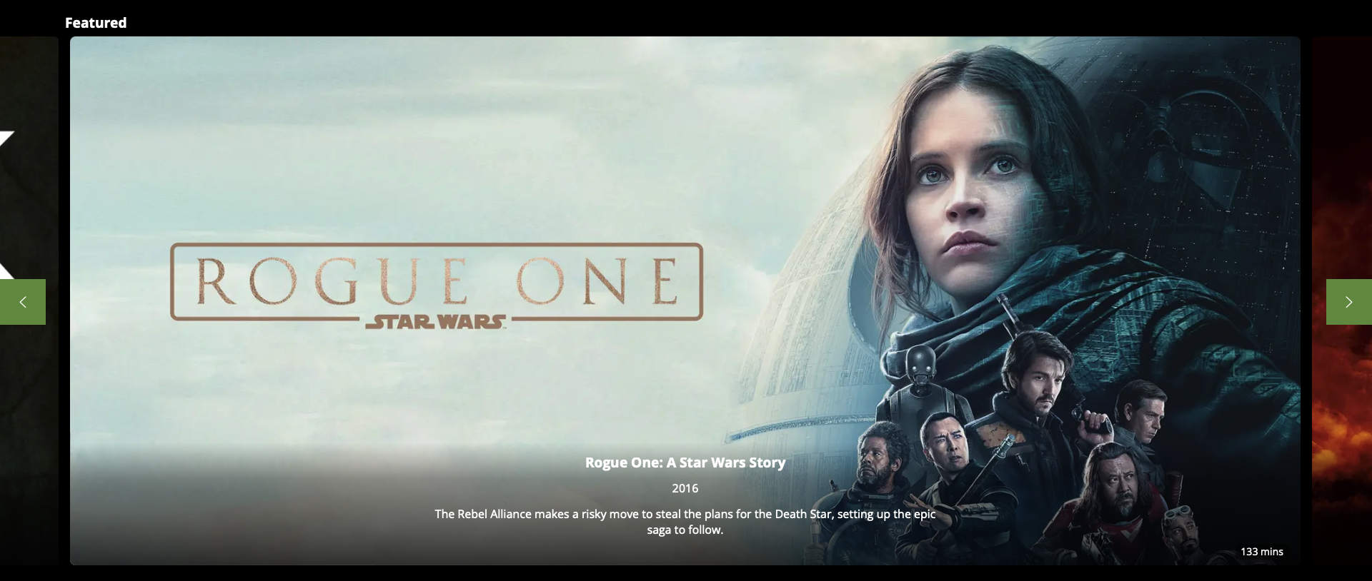
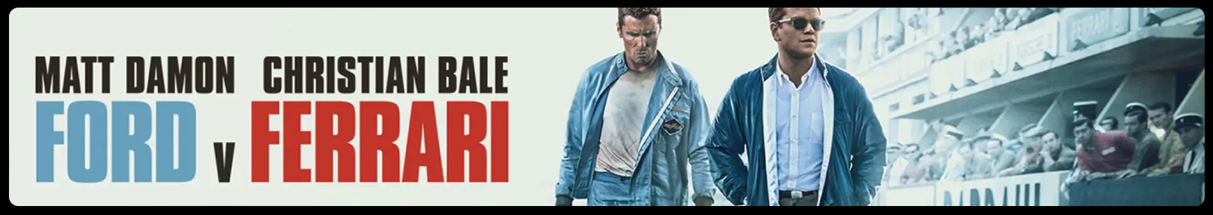
Banner
The Banner element defines a dedicated space for a prominent image. Banners are often used to highlight promotional content or announcements. They can also be made interactive, allowing users to click or tap on the banner to be redirected to other pages or content.
Banners elements are populated by categories, which means that the content displayed in the banner element is determined by the categories assigned to it. Banners that are configured to display for matching categories will be displayed in the banner element. This allows for dynamic, curated content that aligns with specific user interests or business objectives.
Style
The Banner element offers several configuration settings that control its appearance and behaviour, providing flexibility in how it is displayed.
- Page Margin: You can toggle the page margin on or off. If the page margin is enabled, this allows for additional customisation options such as corner styling.
- Corner Style: When the Page Margin is toggled on, you can choose between rounded or squared corners for the banner.
- Parallax Scrolling: The Parallax effect can be toggled on or off, allowing for a dynamic scrolling experience where the banner moves at a different speed than the rest of the page. This can add depth and visual interest to your layout, making the banner stand out even more.
- Size Options: There are various size options available for the banner, allowing you to select the appropriate size for your content and design needs. This ensures the banner fits seamlessly into the overall page layout while delivering impactful visual elements.
Info Page
An Info Page is primarily used for displaying informational content and is ideal for non-interactive layouts. Unlike Flex Pages, Info Pages are not scrollable (except on mobile platforms), and users must fit content into a single, static view. These pages can contain one or two elements, depending on whether a single-column or two-column layout is chosen. The layout can be configured with different column ratios, allowing more space for one column over the other, providing flexibility in design.
Elements
Text
The Text element is used to display written content on the page. You can configure the amount of padding around the text, as well as its alignment, making it suitable for headlines, paragraphs, or other informational content.
Image
The Image element allows users to display images with customizable rendering options. Padding can be configured around the image, and there are several options to adjust how the image is displayed, such as size, scaling, and aspect ratio. This element is useful for adding visual context to informational content.
QR Code
The QR Code element generates and displays a QR code on the page. The padding around the code can be adjusted to fit the layout, and the QR code can be used for various purposes, such as providing quick access to external links, app downloads, or promotional offers.
Updated 8 months ago