Images
When sourcing images, try to find the highest resolution possible. Our image server will scale and crop the image to the different sizes required for each device. If the original image is small, the image server may need to scale it up in size which could result in a loss in image quality.
Hero Images
Hero images are the full screen images on product pages, collection pages etc. They are the largest type of image.
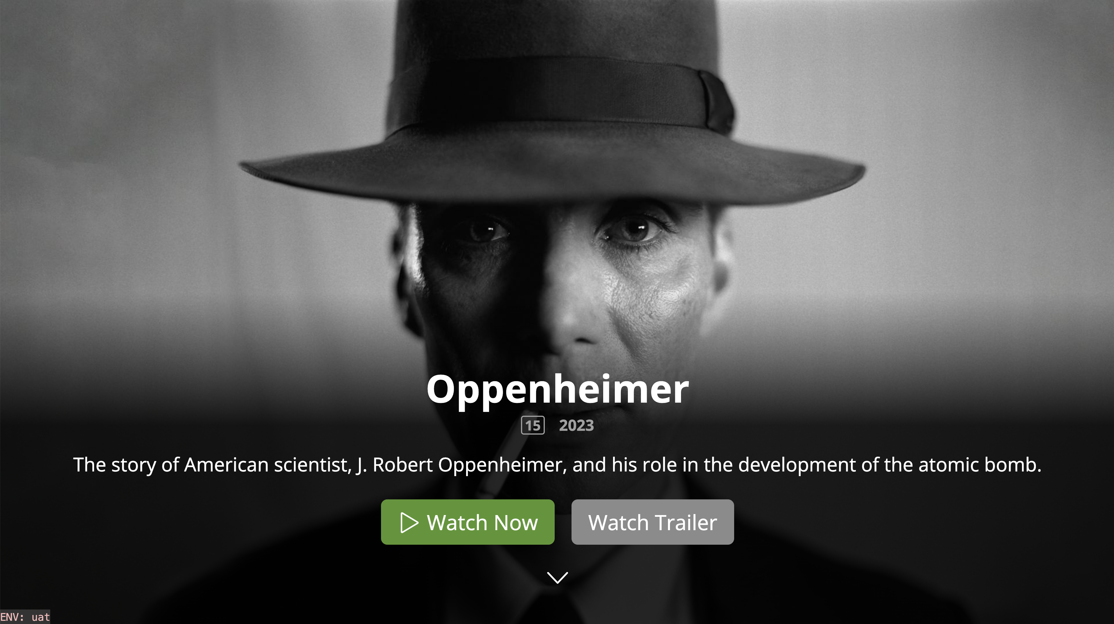
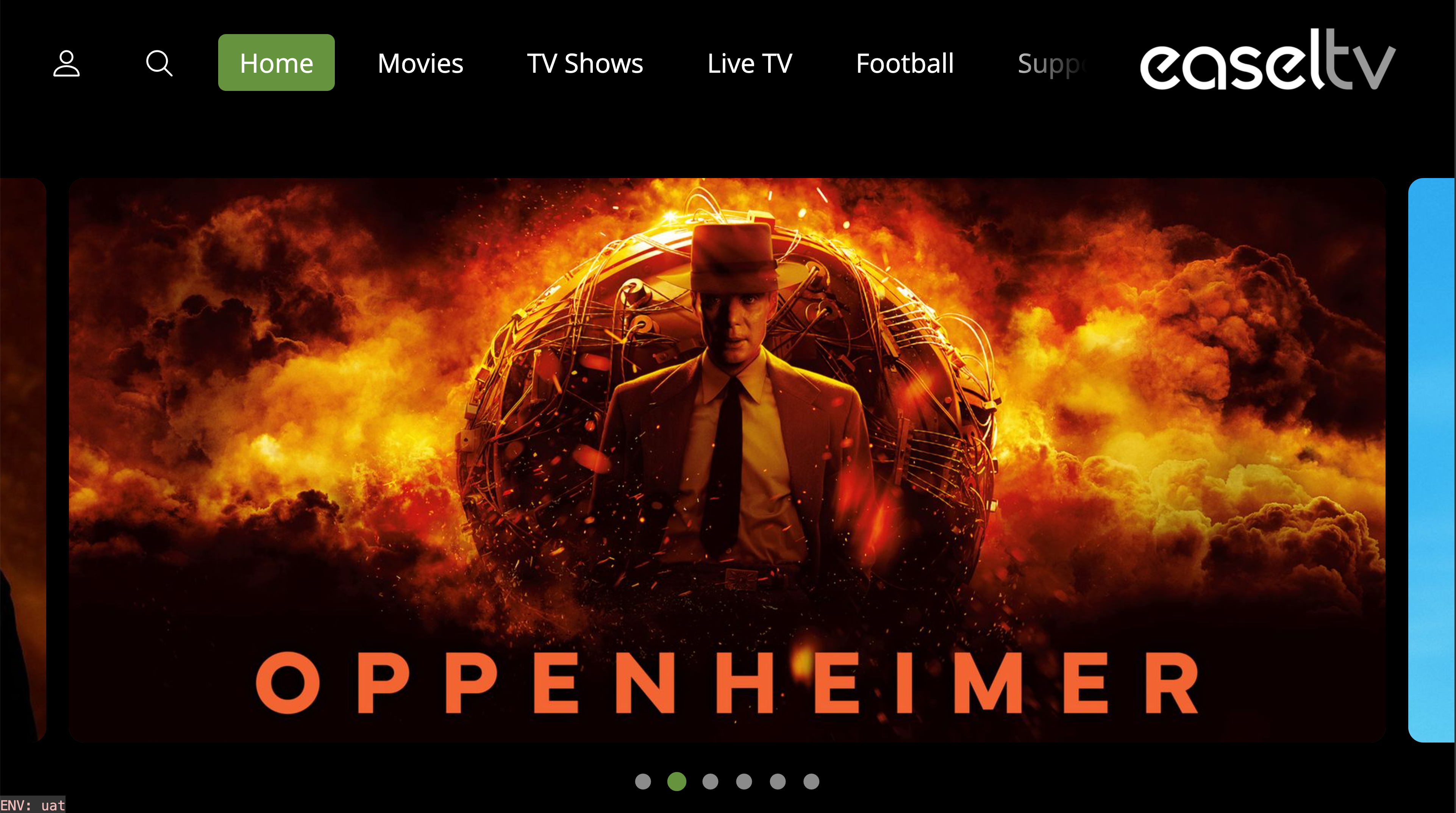
Hero Image
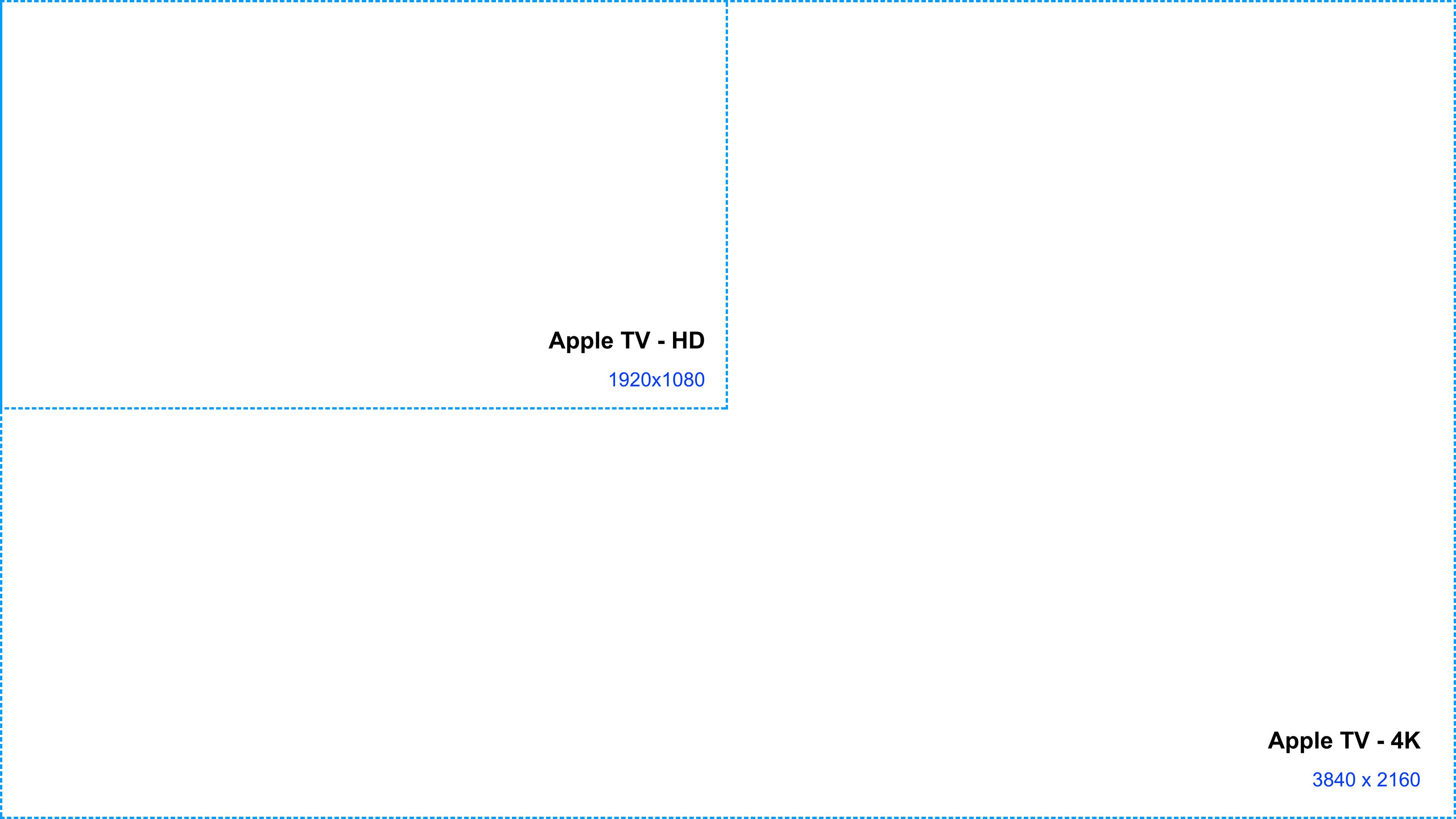
4K TVs (Apple TV)
The minimum recommended image size for Apple TV 4K is 3840x2160. The image server will scale down this image for HD Apple TV devices.
HD TVs (Samsung, LG, Roku, Android, Fire TV)
The minimum recommended image size for HD TVs is 1920x1080.
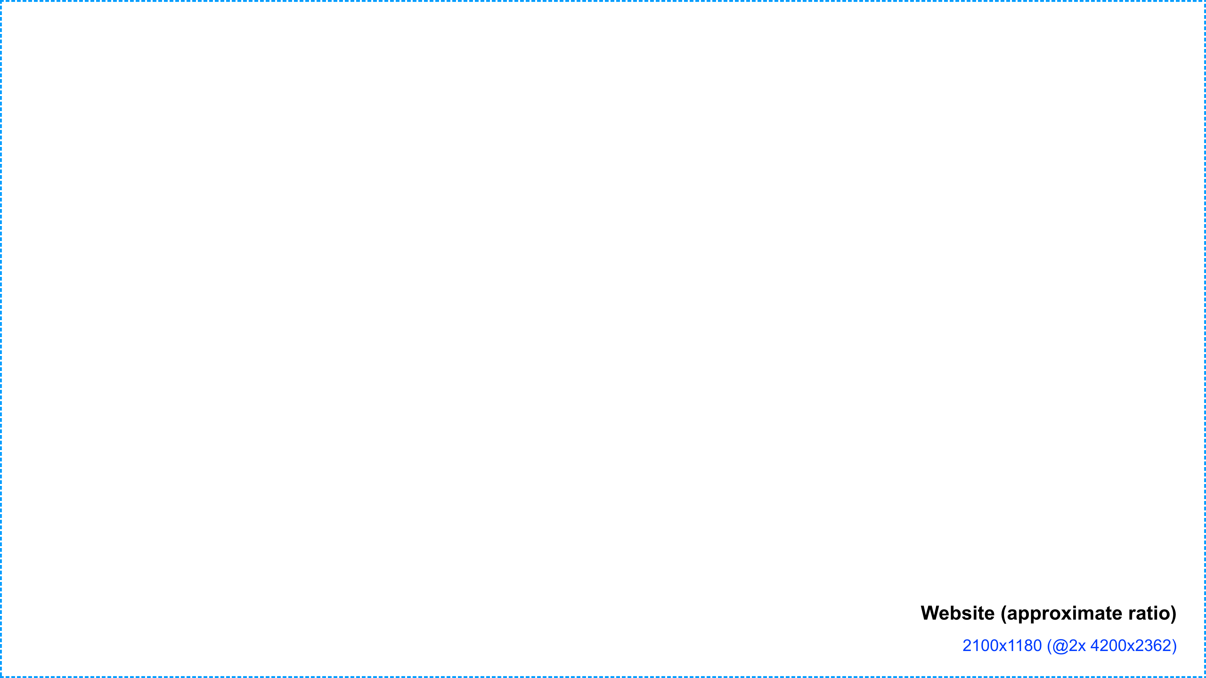
Consumer Website
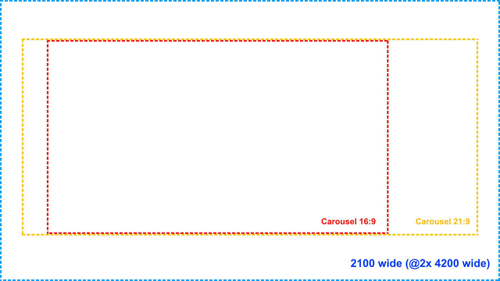
The consumer website loads different images sizes from the image server, depending on the browser window size the customer is using. The largest hero image we use on the website is 2100px wide. However, we also support @2x image resolution to enable crisp, high quality images. This means the source of an image displayed at 2100px wide, would actually be 4200px wide.
The ratio of the browser window can of course vary depending on what the user has it scaled to, so it is not possible to define a max width AND height of the website hero image, but a general guide would be to provide a 16:9 image and the server will crop and scale it down accordingly. This would make the minimum recommended image size approximately 2100x1180 (@2x 4200x2362).
Carousel Images
A Carousel element can be used anywhere on a page and can be displayed with a ratio of 21:9 and 16:9. The carousel can take up nearly all, if not all the width of the page, so the image size should be sufficient to cover this.
Carousel
4K TVs (Apple TV)
The minimum recommended width 4K devices is 3840px.

HD TVs (Samsung, LG, Roku, Android, Fire TV)
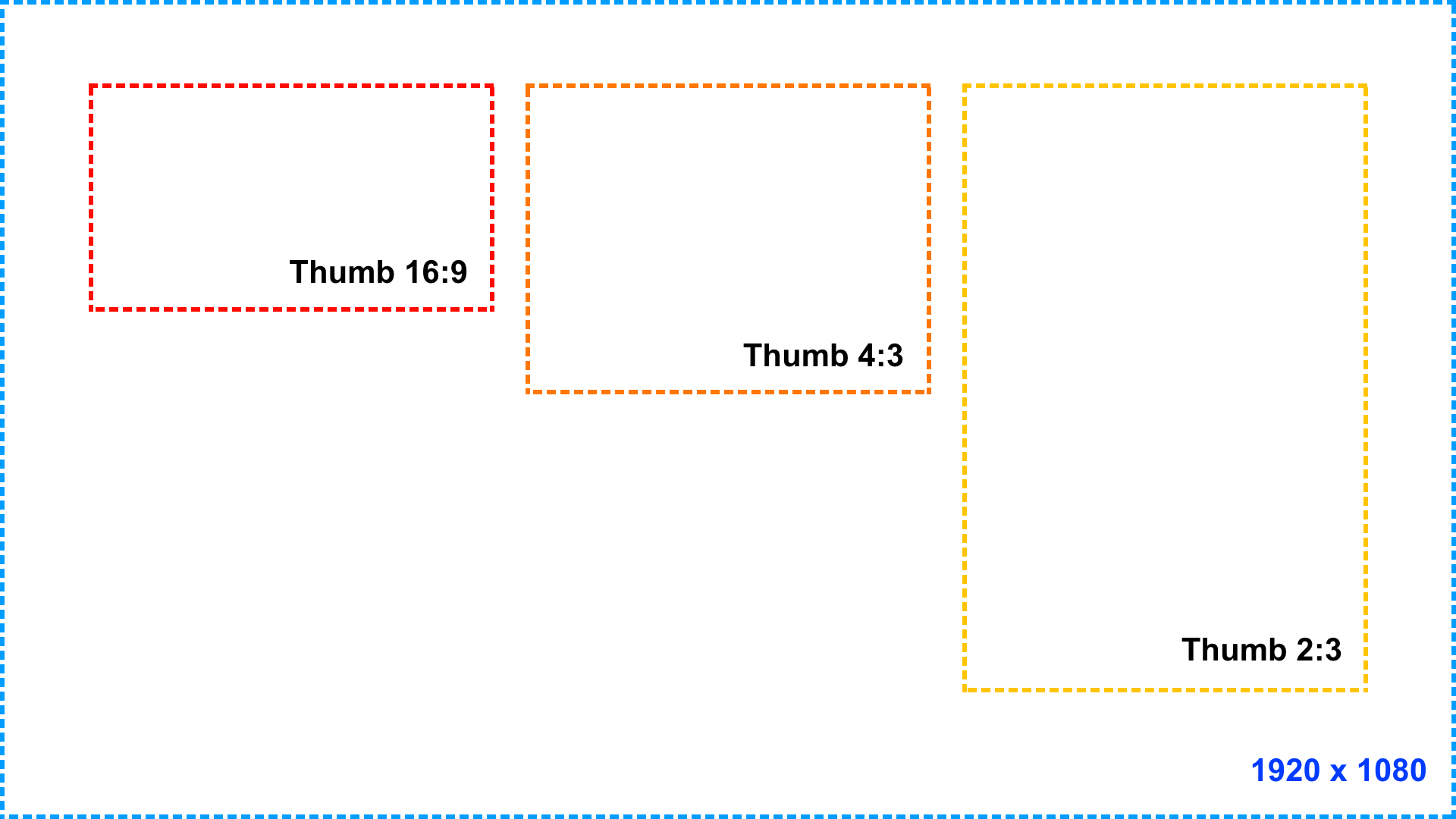
The minimum recommended image size for HD TVs is 1920x1080.

Consumer Website
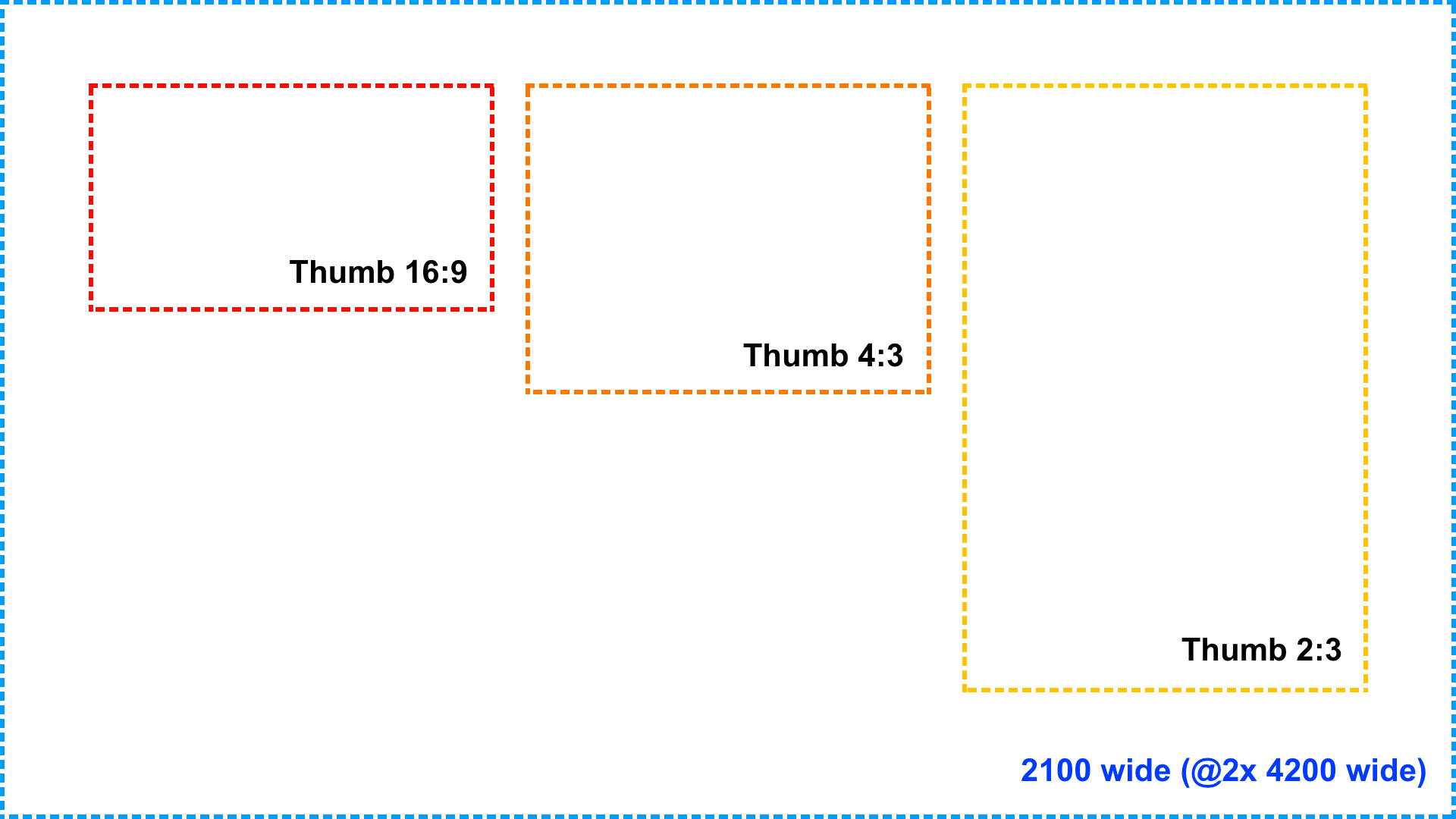
The consumer website loads different images sizes from the image server, depending on the browser window size the customer is using. The largest size carousel image we use on the website is 2100px wide. However, we also support @2x image resolution to enable crisp, high quality images. This means the source of an image displayed at 2100px wide, would ideally be 4200px wide for maximum quality.
The size of the carousel scales with the size of the browser window.
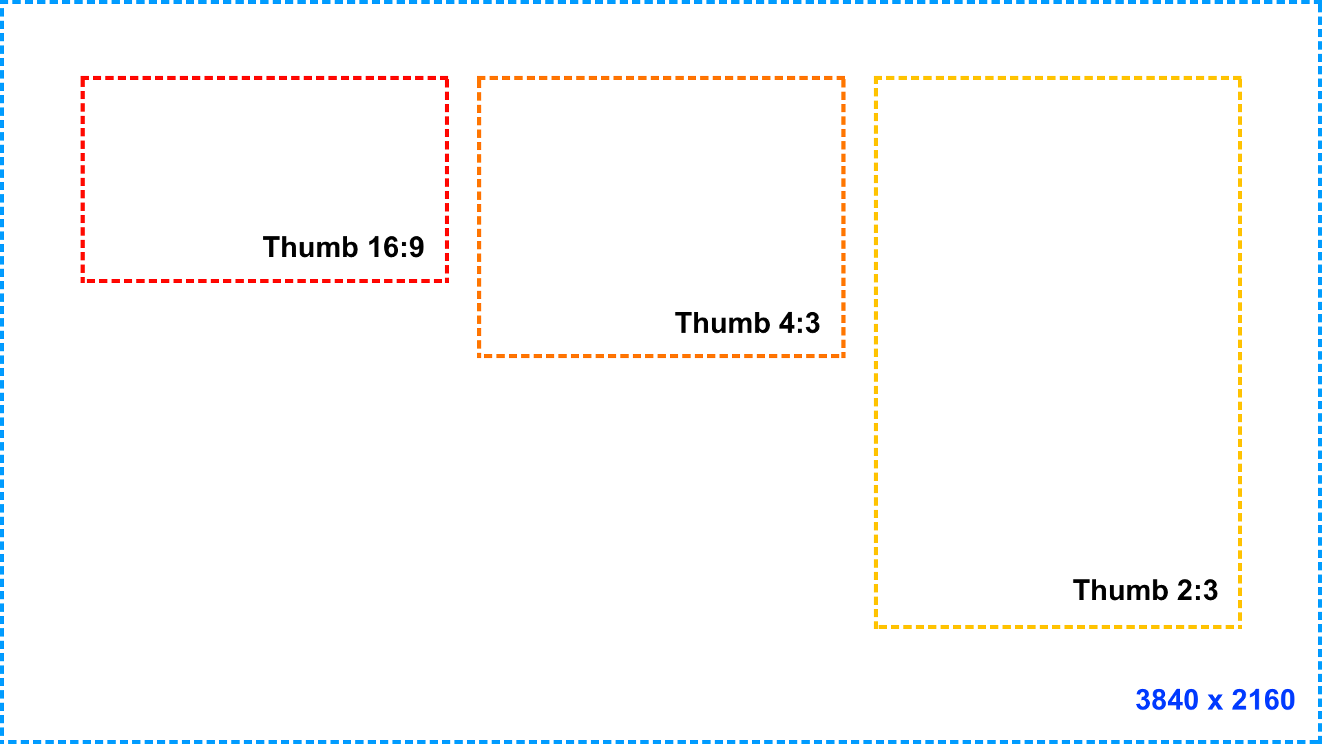
Swimlane and Grid Image Thumbs
You can change the image ratio used in a swimlane or grid, choosing between 16:9, 4:3 or 2:3. The size of an image can also be selected between small, medium and large.
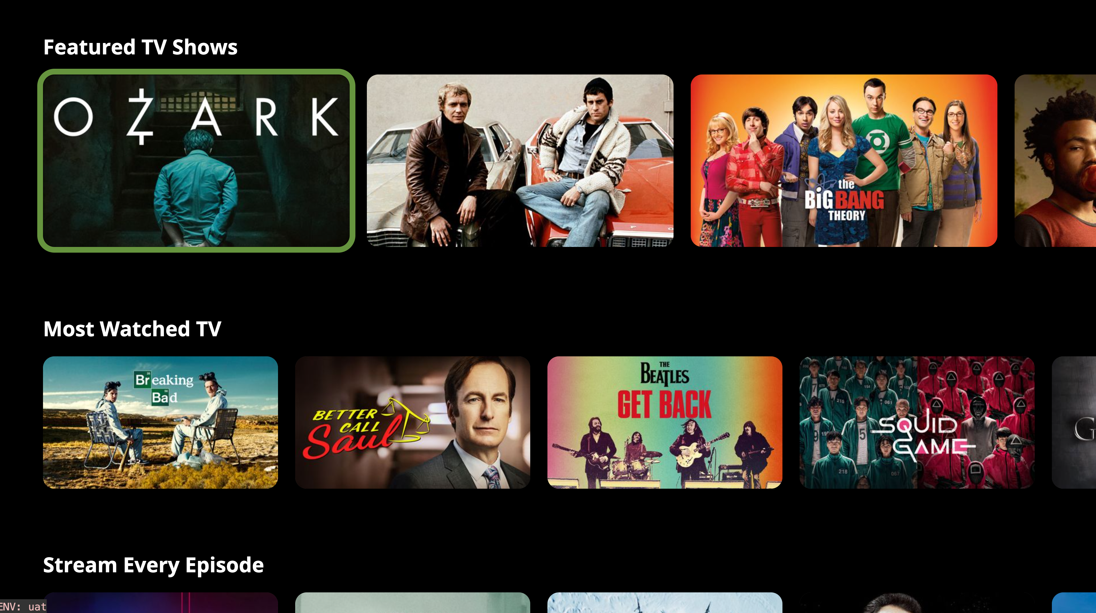
The following examples illustrate the general ratio and appearance of image thumbs (large) on the corresponding screen size.
4K TVs (Apple TV)
HD TVs (Samsung, LG, Roku, Android, Fire TV)
Website
The size of the swimlane/grid image thumbs scale with the browser size. The screen size indicated below is the largest breakpoint the website supports.
Logo
The logo has a fixed height and the width scales accordingly. Here is an illustration of three different logos with different image ratios to illustrate how they are displayed in the app or website (this example is using the TV App).

Notice how the height of the logo is the same in each screengrab, while the width scales, retaining the logo image ratio.
To ensure the logo is displayed with a quality resolution, we recommended a minimum image height of 250px
Updated 8 months ago