Themes
Add your brand colours and logos to your video streaming service
Creating a Theme is often the first step for our clients. You are affectively handed a blank digital canvas to which you can apply your colour scheme and brand logo. As with all our features, we have designed Themes to do most of the work for you, yet also provide you with the flexibility to dive in and edit in colours individually.
Creating a Theme
Your service will come with a default theme which you can edit. You can also create a new theme by selecting Global in the main menu, and then Themes from the subsequent menu.
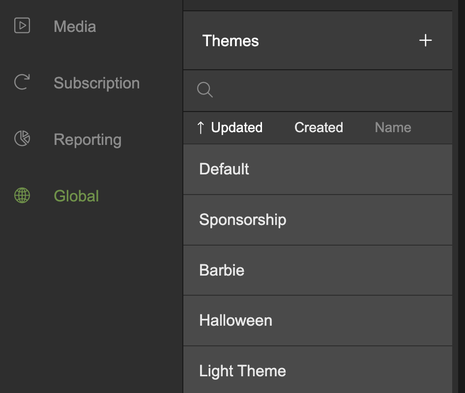
Click the + icon and add a name for your new Theme in the dialogue overlay. Click Create.
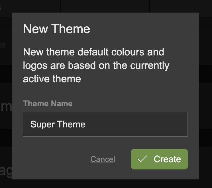
You can create as many themes as you like, each one containing a different colour scheme and logo.
To activate a theme to be used in the consumer apps, click the Activate Theme button.

Editing Prime Colours
In your new Theme you are presented with three Prime Colours. These represent the page Background, a Feature colour which is usually a brand colour used for links, buttons etc, and a Feature MouseOver colour, which will be seen when the user hovers over a link on the consumer website.
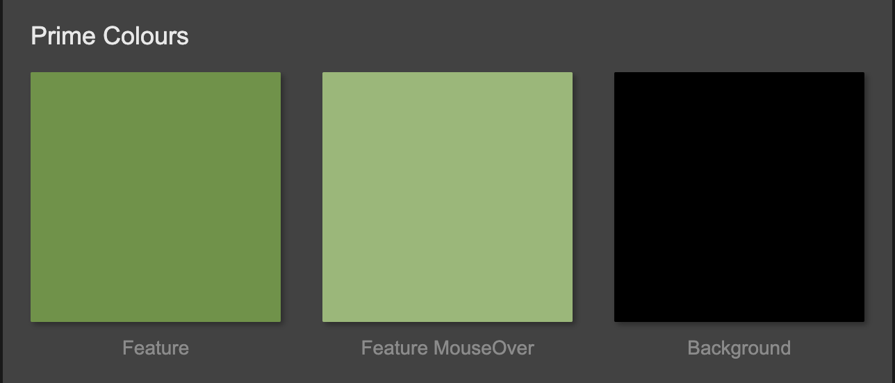
Editing these three colours is enough to configure you entire site! All the rest of the colours will adapt and contrast against light or dark backgrounds.
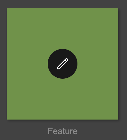
To change a Prime Colour, simple mouseover it and click the edit icon.
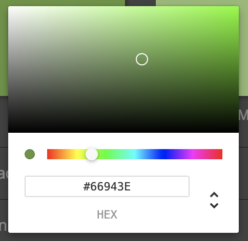
A colour picker will appear with which you can either use the palette to select a colour, or copy and paste an existing HEX, HSL, or RGB colour value.
Page Section Colours
Beneath the Prime Colours are situated the Page Section colours, which allow you to alter the different sections of a page, such as Header and Footer. These Page Section colours are children of the Prime Colours and will update by default with each colour change of a Prime Colour.
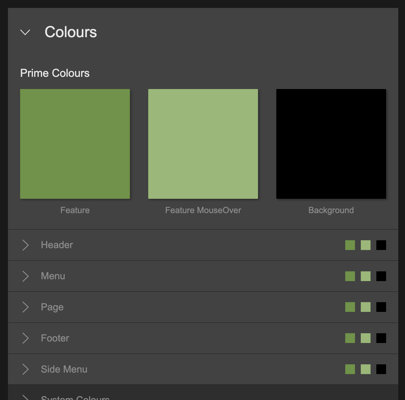
You can override any Page Section Colour directly by expanding the corresponding section, clicking the colour of choice and amending it using the colour picker. The relationship with the Prime Colour will be severed and any further updates of the Prime Colour will not affect the amended Page Section Colour.
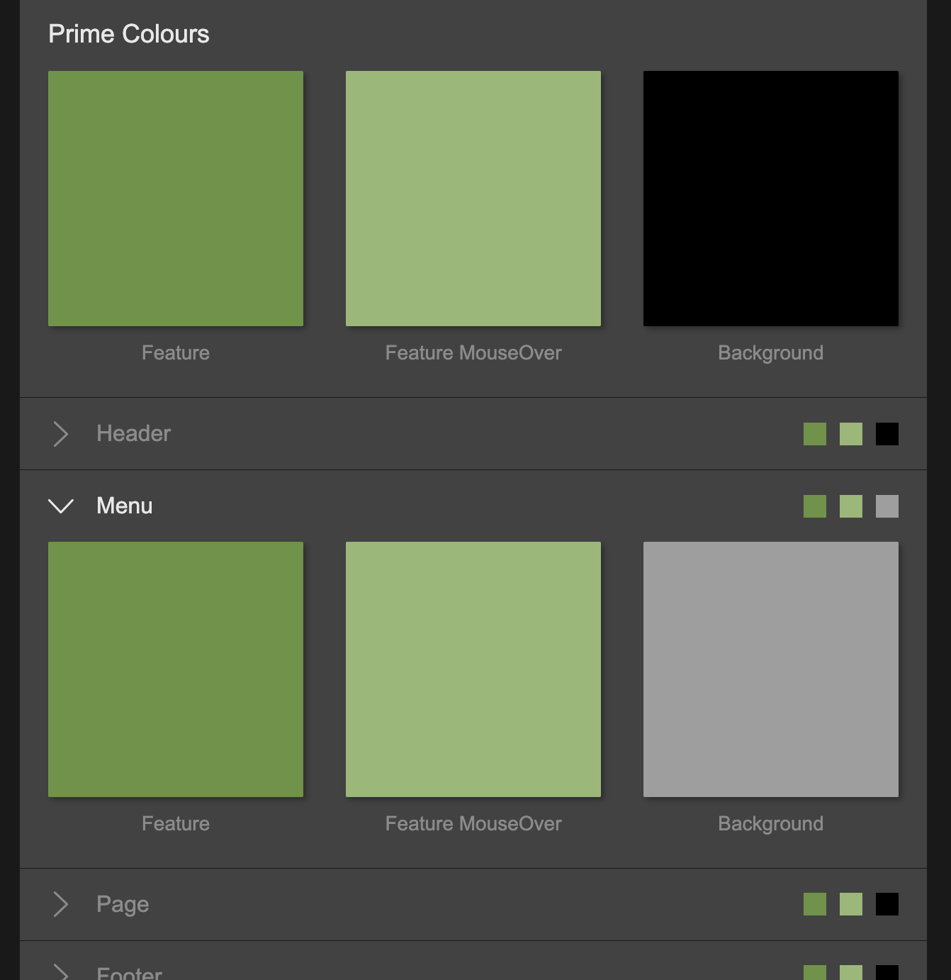
When you mouse over the amended Page Section Colour, you will see the edit and reset button. Clicking reset will reset the Page Section colour back to the current Prime Colour and reconnect the parent/child relationship.
System Colours
System Colours are hidden away colours which take the hassle out of configuring themes by automatically adjusting the colours for text and items to ensure they always contrast against whichever background colour you have defined.
We strongly encourage you to leave these colours as they are, and the system will take care of the rest. However, there are some occasions when these colours might not achieve the optimised effects and you may want to go in and edit them.
When doing so, the essential point to understand is that Flex Colours are a graduation of colours from dark to light. When a dark background is selected, the lighter colours are selected by our system for text and items to ensure they contrast with the background colour. When a light background is used, the darker colours are selected. When editing the colours, it is important keep this rule in mind!
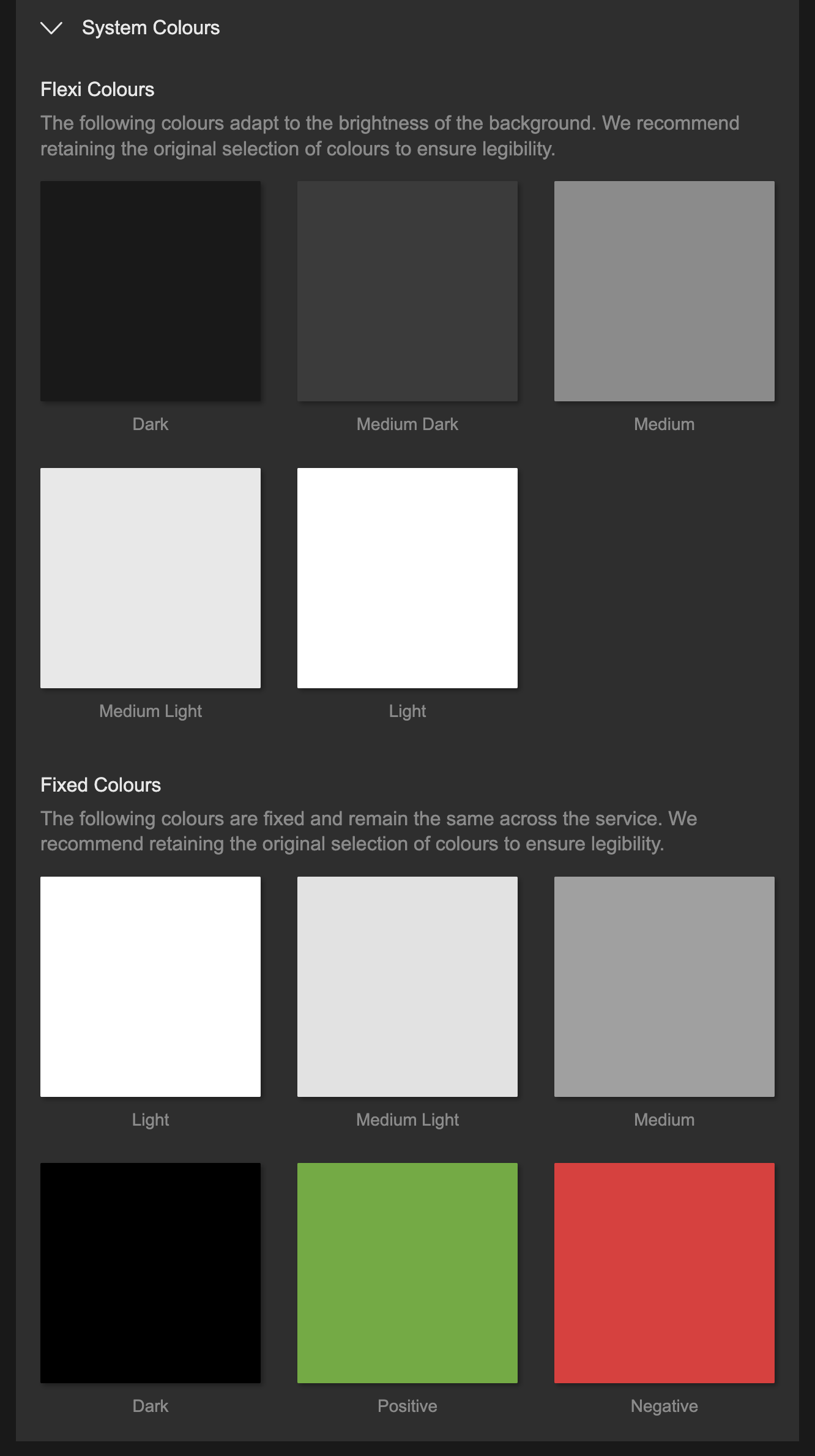
Fixed colours are used over something which we know is always dark or light, for example, the dark gradient over a hero image.
Positive and negative colours are used for positive and negative confirmation and text, such as an error message.
Logos
You can upload a logo by expanding the logo section and dragging and dropping an image onto the drop zone. Alternative, click the upload icon and select the image from your hard drive.
Preferably, use SVG format for your logo upload. SVG files are ideal as they maintain quality regardless of size adjustments and ensure sharpness on high-resolution screens. If an SVG is unavailable, use PNG as an alternative. For PNG files, it's recommended to have a minimum height of 200 pixels. This ensures the logo retains clarity and detail when displayed on various devices.
Note, there is a dark and light image. Uploading both a dark and light version of your image, allows our system to dynamically switch between them depending on the background colour. For example, if you had a dark background, the light logo would be displayed in the apps. If you switched the background to a light colour, the logo would automatically switch to the dark logo to contrast the background.
Favicon
It is not currently possible to upload a favicon via the Dashboard. You may either add a favicon using our API, or simply get in touch and we'll sort it out for you!
Updated 6 months ago
