Labels
Labels are small banner ads that can be used to overlay product tiles and product page images. They can be customized with either images or text and are often used for sponsorship, promotions, displaying information, or anything that suits your use case. This user guide will explain how to create and configure labels.
Create a Label
- Select Promotional from the main menu.
- Click on Labels within the "Promotional" section and click the "plus" (+) icon.
- Enter a name in the subsequent overlay and click 'Create'.
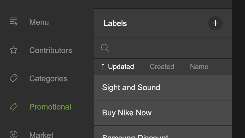
Click the + icon and enter a name to create a new label
Scheduling Content Windows
You can schedule content changes and the availability of your labels in the Content Windows section.
- Click the Content Windows section to expand it, revealing the Content Windows timeline.
Navigating the Content Windows Timeline
In the top right of the Content Windows section, you can click on Week, Month, or Year to update the time period viewable in the timeline.
To the right of the time period controls, there are left, right, and 'Today' buttons.
- Press the left arrow button to scroll along the timeline to the left.
- Press the right arrow button to scroll along the timeline to the right.
- Press the Today button to jump the timeline to today's date.
- The timeline can also be scrolled using your trackpad or mouse scroll wheel.
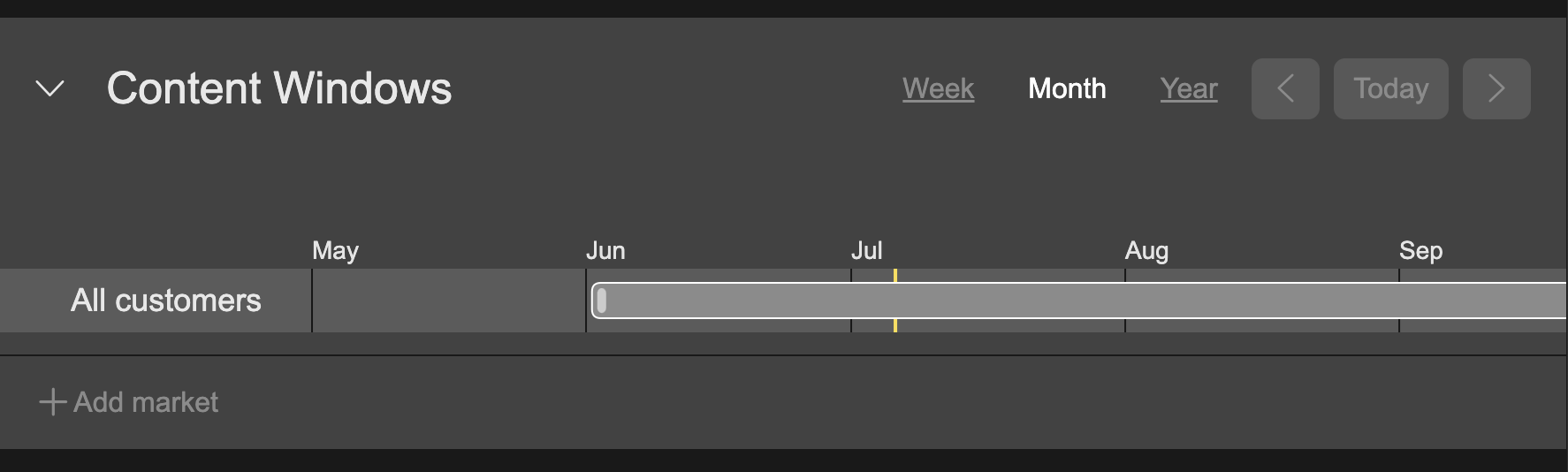
Use the left and right arrow or your trackpad/mouse-scroller to scroll along the timeline
Adding Content Windows
You can add one or more content windows to the timeline. Each content window has a start and end date that defines the availability of your label to the customer. The style and content of your label can be changed for each content window.
- Click the Content Windows section to expand it.
- In the Content Windows timeline, mouseover an empty area. A semi-transparent 'ghost window' will appear, showing you where your content window can go.
- Ghost windows only appear over empty sections that do not contain an existing Content Window.
- Click the ghost window.
- A dialogue will appear allowing you to enter a Visible From date/time and Visible To date/time. Click on either date/time field to access the calendar and define your dates and times.
- The Visible To date is not mandatory.
- You cannot enter dates that overlap an existing Content Window.
- Click Cancel to discard any changes and close the dialogue, or click Create to create the content window.
- The Content Window is added to the timeline.
When creating a new content window, the content window for the currently selected content window will be duplicated.
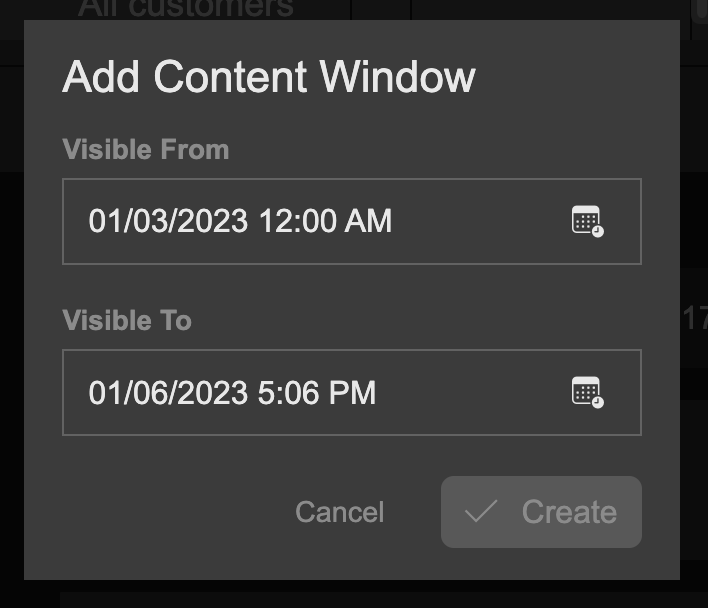
Define a visible from and to date for the content window
Editing Existing Content Window Schedules
You can update the start and end dates for existing content windows by double-clicking a content window segment on the timeline and changing the Visible From and Visible To dates and times, as outlined under 'Adding Content Windows'.
Alternatively, you can reschedule a content window by dragging a content window segment directly.
- Click a content window segment on the timeline to select it.
- You can drag it left and right to move it to a new date.
- You can also grab the left or right sides of the content window segment and drag them to extend or reduce the size of the segment and change the start and end date/time accordingly.
- Note: content windows can not overlap other content windows. You can only drag them within empty sections of the timeline.
Changing Content for Content Windows
The content for each window can be changed.
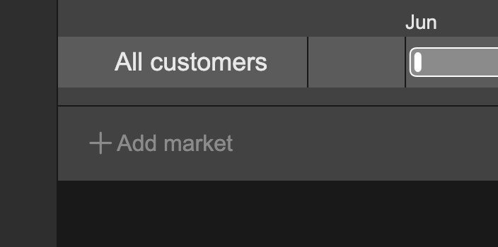
- Select an existing content window in the Content Windows timeline by single-clicking it.
- The 'Selected content window' date/time changes to show which content window is currently selected.
- Make any changes to your content as you like, and that's it, done.

The 'Selected content window' date/time, indicating which content window is currently selected.
The above process can be done with any content window, allowing you to alter your content from one content window to another, all under the same label.
Markets
Content windows can be created for different markets, allowing you to target different variations of your label to different user groups.
- Click the Content Windows section to expand it.
- At the bottom of the section, beneath the timeline, you see the '+Add Market' button.
- Click +Add Market. A dialogue will appear with a select menu containing existing markets.
- Select an existing market from the select menu.
- Another timeline will be added to the Content Windows section, enabling you to add one or more content windows that will be available only to the selected target market.
Click '+ Add Market' to add additional timelines targeted at different markets
Categories
We use categories to target labels to matching products. For example, a label with an 'Action' category would be displayed over a product which also has an 'Action' category.
- Click the Categories section to expand it.
- All the existing available categories are listed with a clickable check to the right of each one.
- To add a category to the label, simply select the checkbox.
- You can add multiple categories to a label.
- Search for a category by entering matching text in the search field. This will filter the list to category names matching the search query.
- Click Show All to list all available categories. Click Show Selected to list only the categories you have selected. A number is displayed next to Show Selected indicating the number of categories that have been selected.
- When Show Selected is selected, a Deselect All option is available. Click this to deselect all selected categories. You will be asked to confirm.
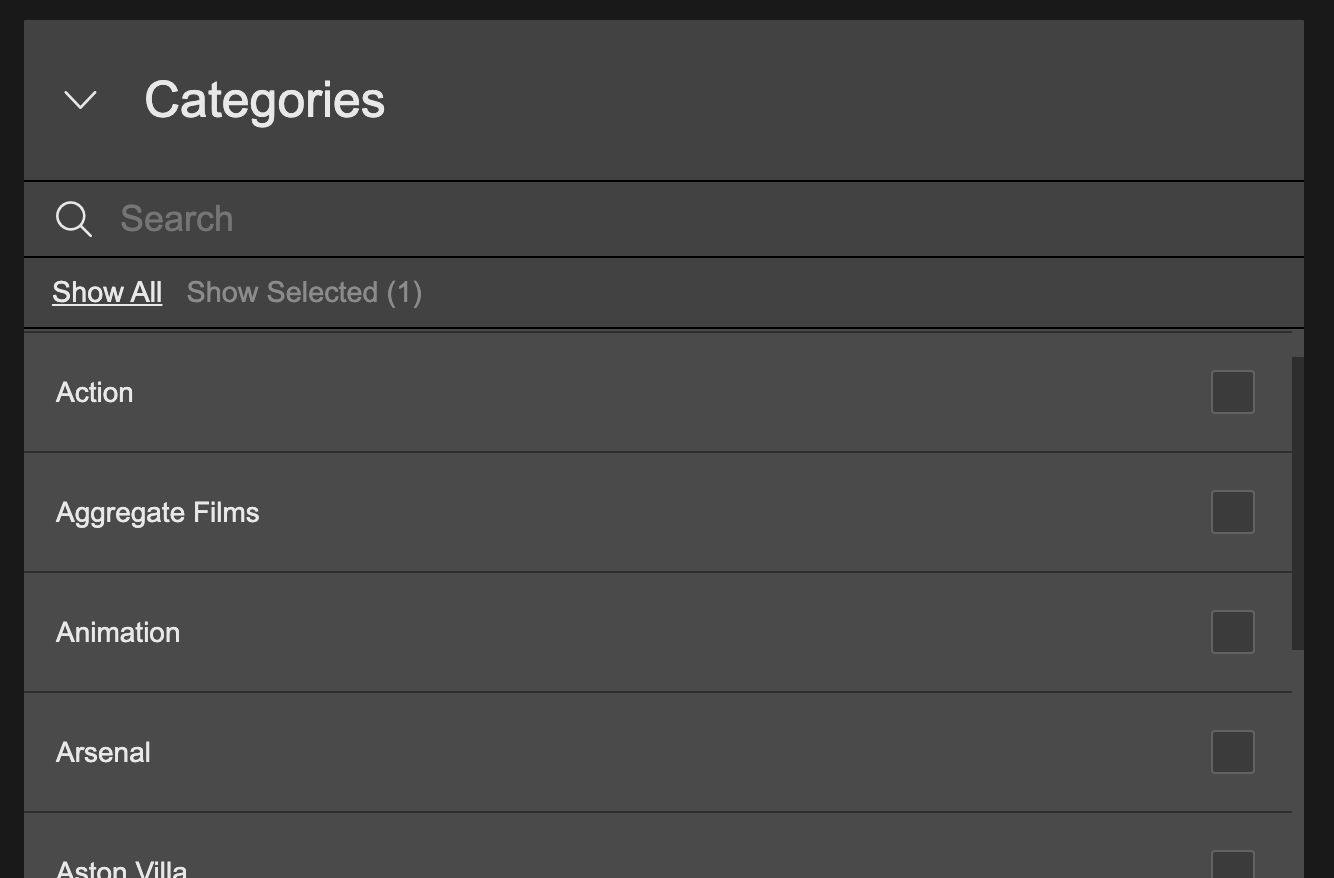
Click the checkboxes to select categories
Blacklist
Products can have multiple categories, so although you want your label to be displayed on a product with say 'Action', you may wish to exclude it from products which also have say 'Adult'. You achieve this by selecting the categories you wish to avoid in your blacklist.
- Click the Blacklist section to expand it.
- All the existing available categories are listed with a clickable check to the right of each one.
- To add a category to the label blacklist, simply select the checkbox.
- You can add multiple blacklist categories to a label.
- Search for a category by entering matching text in the search field. This will filter the list to category names matching the search query.
- Click Show All to list all available categories. Click Show Selected to list only the categories you have selected. A number is displayed next to Show Selected indicating the number of categories that have been selected.
- When Show Selected is selected, a Deselect All option is available. Click this to deselect all selected categories. You will be asked to confirm.
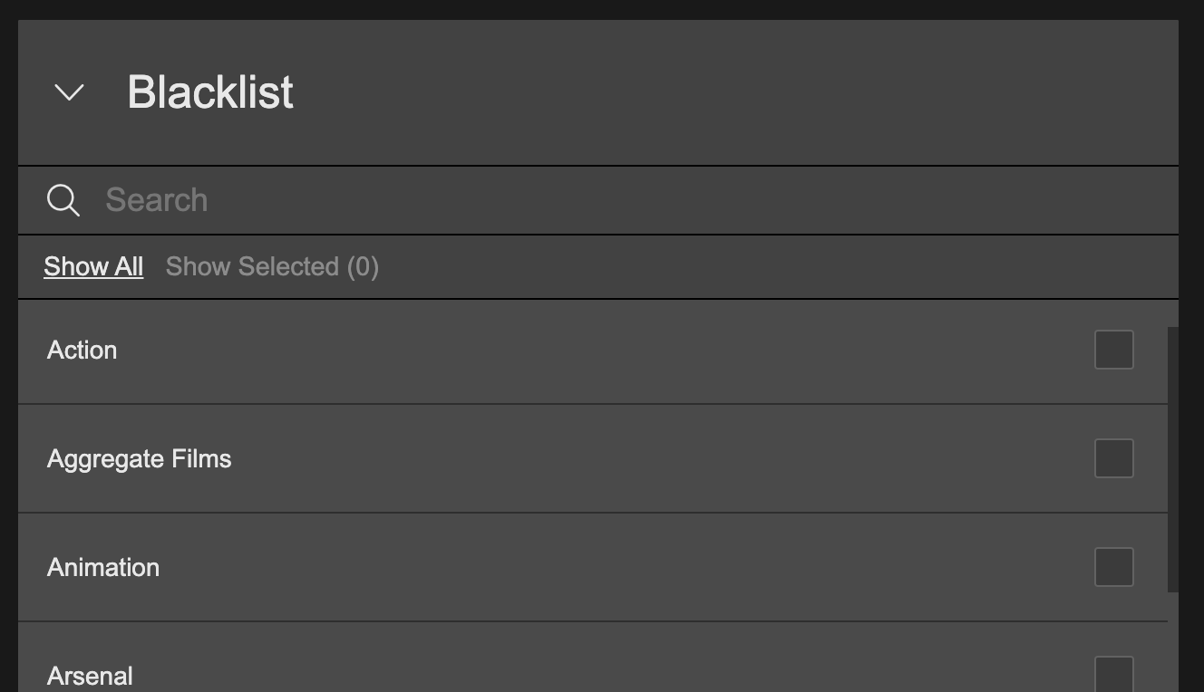
Click the checkboxes to select categories which will be blacklisted and avoided
Label Text
A label can contain an image or text. If no image exists, the label will fallback to displaying the text.
- Click the Label Text section to expand it.
- Enter your choice of text in the Label Text text field. This will be the text that appears on your label.
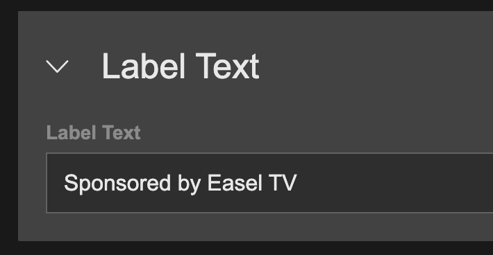
Add text to your label
Images
A single master image can be added to your label which will be displayed over product tiles and product page hero images. You also have a different image for tiles and pages.
- Click the Images section to expand it.
- Drag and drop an image file onto Images. This will create the Image Set Master.
- The Image Set Master in turn creates two related child images: Tile and Page.
- You can drag and drop a replacement image onto the Image Set Master, which will update both child images, Tile and Page.
Update Tile and Page Images
Tile and Page images can be updated individually.
- In the Images section, click Overrides to expand it, revealing Tile and Page.
- Drag and drop a replacement image onto either Tile or Page.
- The updated child image is now no longer related to the parent Image Set Master and will not change if you replace the master image.
Reset Tile or Page Images
- Mouse over the Tile or Page image.
- A 'Reset' button will appear. Click Reset, and the image will revert back to the parent Image Set Master image and will now change whenever the master image is updated.
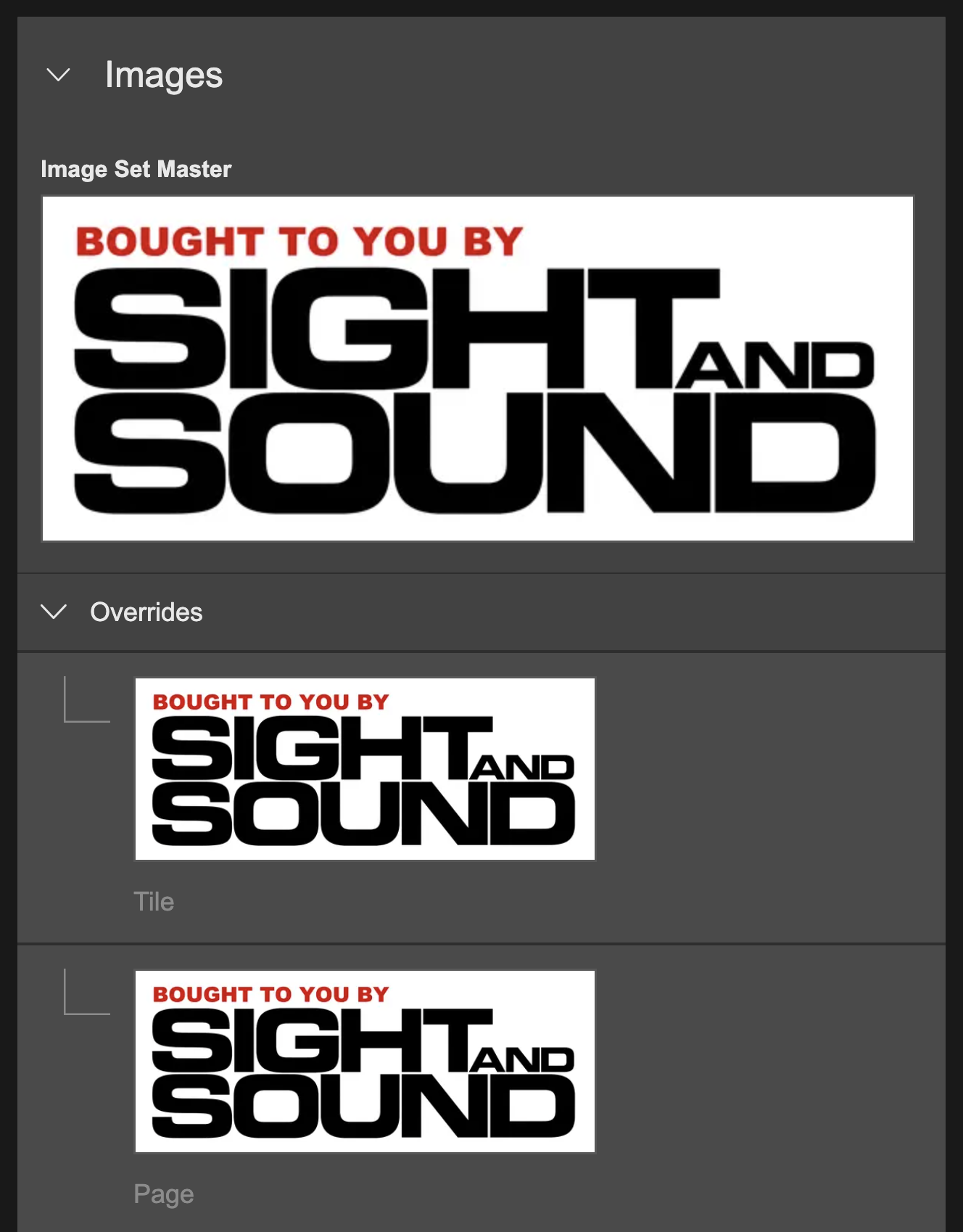
Drag and drop a master images and individual Tile and Page images
Links
You can create three types of links: External Links, Internal Links, and System Links.
- External links require a URL to link to an external destination.
- Internal links can point to a page, collection, or product within your service.
- System links target pages that are not created by you, including Registration, sign-in, etc.
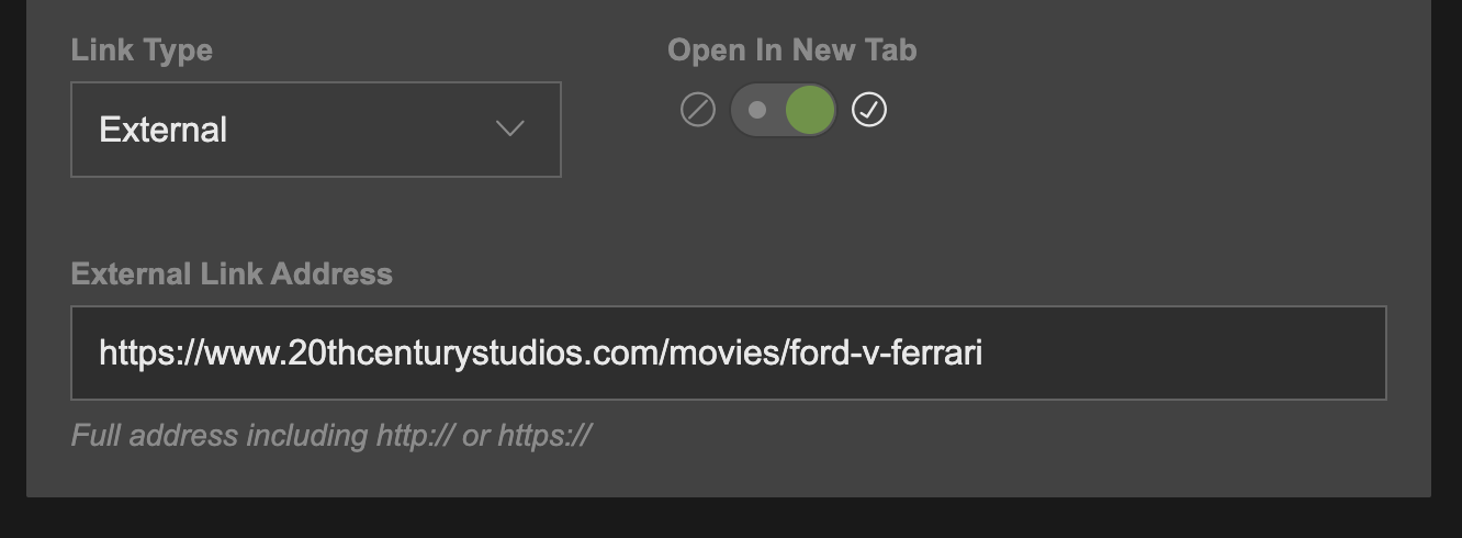
Creating a Link
- To create a link, click on the Link section to expand it.
- Select the link type from the Link Type drop-down menu; the way of providing a link is different depending on the selected Link Type, as outlined below.
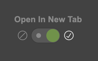
- Click the Open In New Tab toggle switch to turn it on or off. When switched on, if a label is clicked the consumer website, the destination will be opened in a new tab. When switched off, the destination will be opened in the same browser tab.
External Links
- Select External Links from the Link Type drop-down menu.
- The External Link Address text field will appear.
- Enter the web address of your choice into the text field.
It is important to include the protocol (http:// or https:// part of the URL)
Internal Links
- Select Internal Links from the Link Type drop-down menu.
- The internal link drag and drop area will appear.
- Navigate to the page, collection, or product in the left menu that you wish to link the label to, and drag and drop it onto the drag and drop area.

System Links
- Select System Links from the Link Type drop-down menu.
- The drop-down menu containing system pages will appear.
- Select the system page you wish the label ad to link to.

Page Label Configuration
You can configure the style of your label when displayed over the product page hero image.
- Click the Page Label Configuration section to expand it.
- Flip the Visibility switch to set whether the label will be seen on product pages that have matching categories.
- Corner Style can be switched between rounded corners and square corners.
- Set on which side of the hero image you would like the label to be displayed by switching Alignment to left or right.
- Top Margin can be set between None, Small, Medium, and Large. This will define how far away from the top of the hero image the label will be displayed.
- Side Margin can be set between None, Small, Medium, and Large. This will define how far away from the left or right of the hero image the label will be displayed.
- Size defines how big the label will be:
- If it is an image label, it will set the size of the image.
- If it is a text label, it will set the font size of the text.
- You can set the colors for text labels:
- Mouse over either of the color squares situated under the Text Label Colors.
- Click the pen icon that appears.
- This will display a color palette that you can use to update the color.
- You can also enter a color value directly in the color palette text field. Click the up/down arrows to cycle between different color input types (HEX, RGB, and HSL).
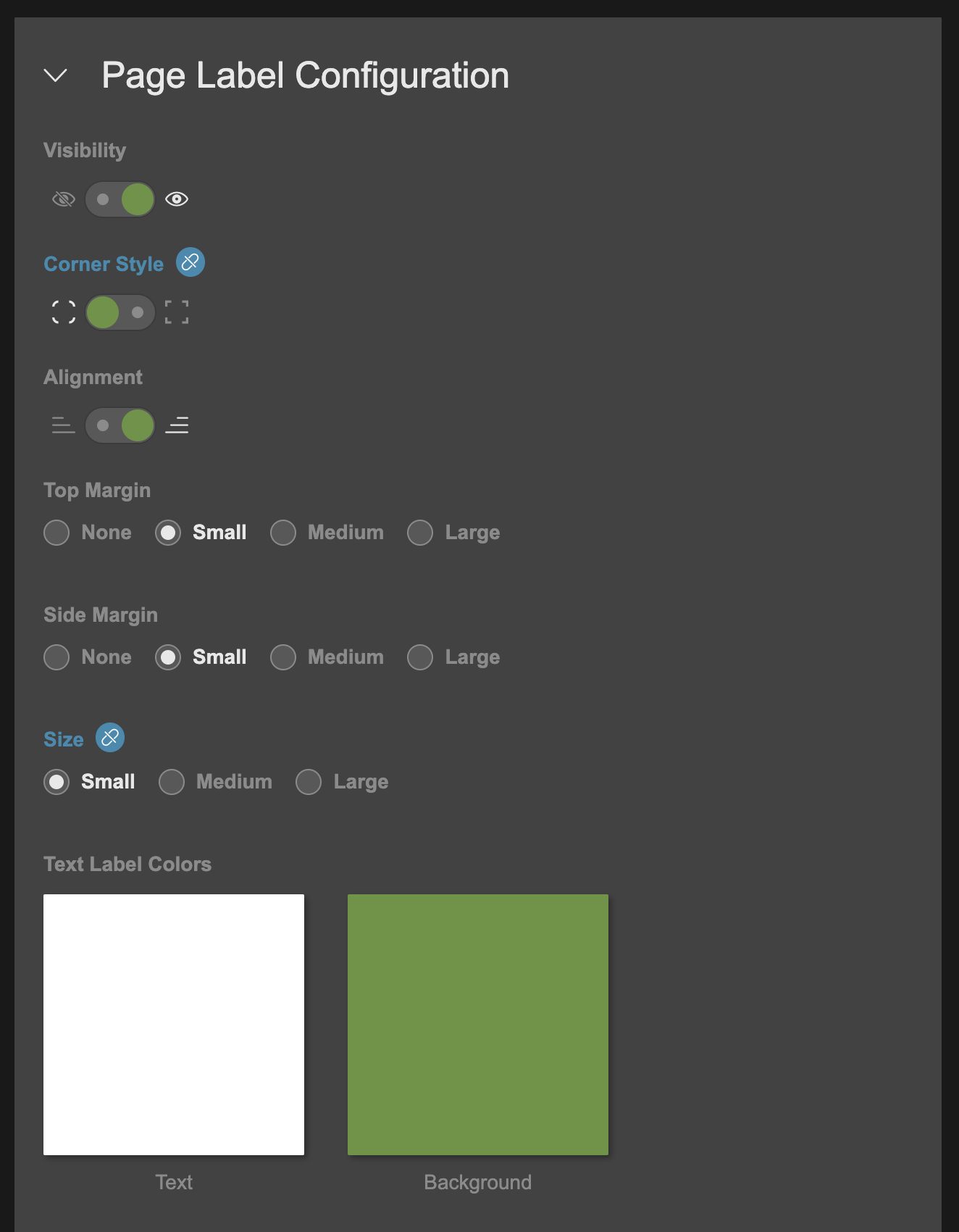
Update settings for labels which appear over product page hero images
Tile Label Configuration
You can configure the style of your label when displayed over the product tile image (i.e. when displayed in a carousel, swimlane etc).
- Click the Tile Label Configuration section to expand it.
- Flip the Visibility switch to set whether the label will be seen on product tiles (that have matching categories)
- Corner Style can be switched between rounded corners and square corners.
- Set on which side of the product tile you would like the label to be displayed by switching Alignment to left or right.
- Top Margin can be set between None, Small, Medium, and Large. This will define how far away from the top of the product tile image the label will be displayed.
- Side Margin can be set between None, Small, Medium, and Large. This will define how far away from the left or right of the product tile image the label will be displayed.
- Size defines how big the label will be:
- If it is an image label, it will set the size of the image.
- If it is a text label, it will set the font size of the text.
- You can set the colors for text labels under Text Label Colors:
- Mouse over either of the color squares.
- Click the pen icon that appears.
- This will display a color palette that you can use to update the color.
- You can also enter a color value directly in the color palette text field. Click the up/down arrows to cycle between different color input types (HEX, RGB, and HSL).
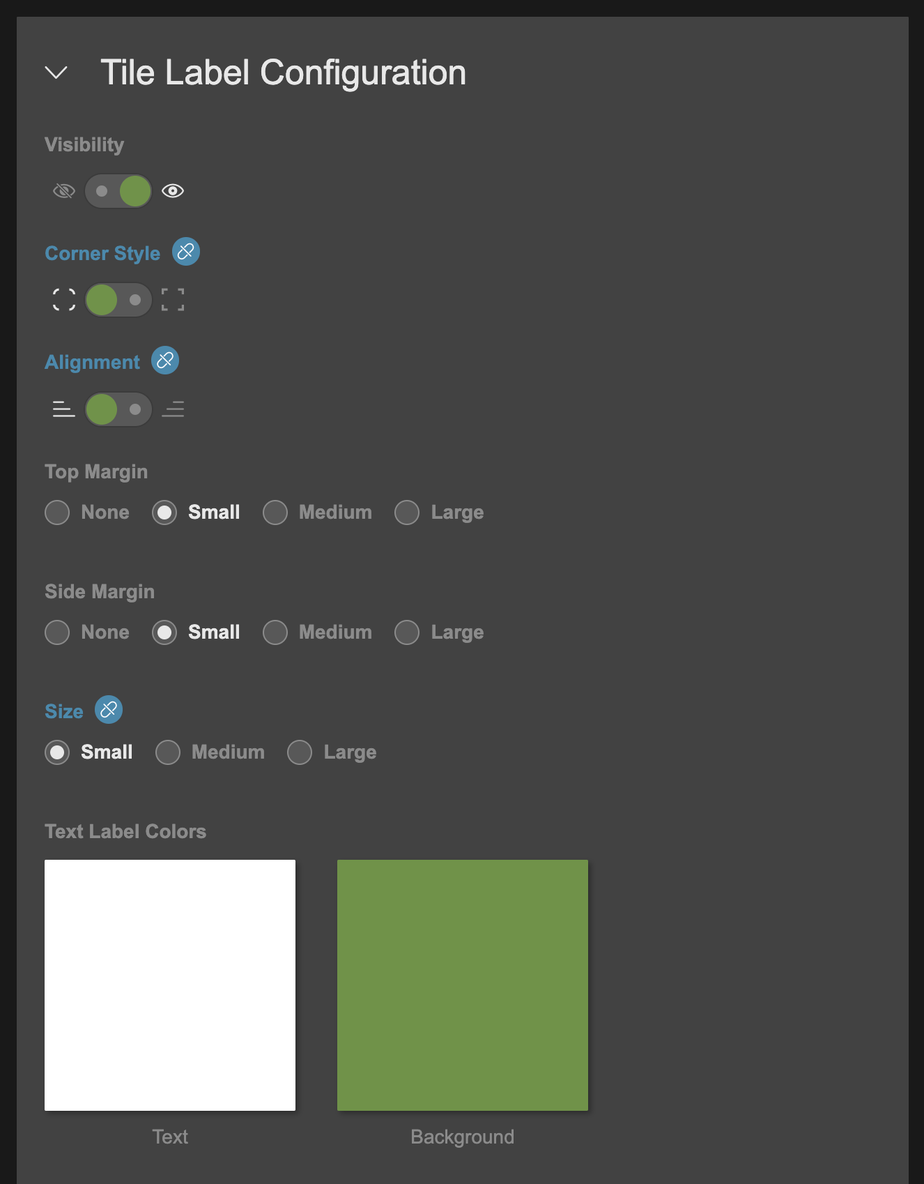
Update settings for labels which appear over product tiles
Label Overrides
You can configure default style settings for Page Labels in Global. Changing a setting in global will update the same setting across all labels. Changing a setting on an individual label overrides the Global setting, and the relationship is removed. This is illustrated by the broken link icon that appears next to the overridden blue title.
To reset the relationship with the Global setting, hover over the icon and click Reset.
The setting switches to the Global configuration, and the blue icon disappears.
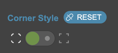
Click 'Reset' to default the setting back to the Global configuration
Updated 8 months ago